Are UK greenhouse gas emissions on the rise?
Writing in today's Daily Mirror, John Prescott accused the Coalition of abandoning its commitment to be "the greenest government ever". To illustrate what he regards as the Government's failure to respond to the threat of climate change, he cited one particular statistic - that over the course of the previous year the UK's greenhouse gas emissions have increased by 3.5%.
This is an official statistic: earlier this year the Department for Energy and Climate Change (DECC) noted that between 2011 and 2012 there was a 3.5% growth in UK emissions of the six greenhouse gases included in the Kyoto Protocol. This means that the UK pumped out something close to an extra 20 million tonnes of greenhouse gases (carbon dioxide or carbon dioxide equivalent units) between one year and the next.
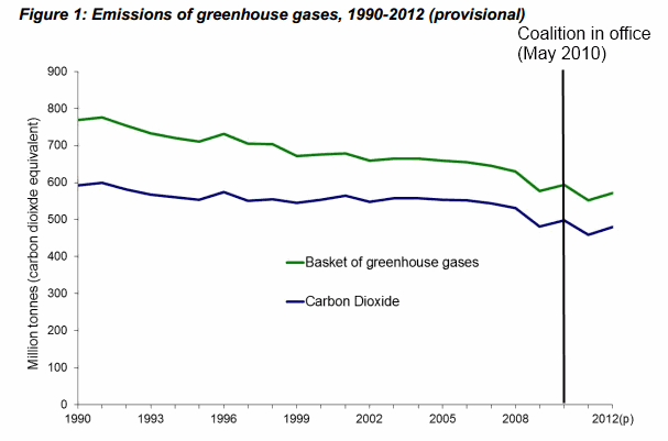
The graph below shows what's happened to UK greenhouse gas emissions under the Coalition:
Join 73,000 newsletter subscribers who trust us to check the facts
Sign up to get weekly updates on politics, immigration, health and more.
Subscribe to weekly email newsletters from Full Fact for updates on politics, immigration, health and more. Our fact checks are free to read but not to produce, so you will also get occasional emails about fundraising and other ways you can help. You can unsubscribe at any time. For more information about how we use your data see our Privacy Policy.
According to the Government, the increase in emissions can be explained by the fact that in 2012 UK power stations were burning more coal and less natural gas (which is a cleaner fuel). At the same time, there was also an increase in household gas use, possibly a result of the winter of 2012 being colder - on average - than that of 2011. In the Department's own words:
"The increase in actual emissions from the previous quarter largely reflects the fact that temperatures were lower in the final quarter of 2012 compared with the equivalent quarter in 2011, by around 2.3 degrees Celsius on average."
If we have a particularly bitter January, for example, it follows that we'll see an increase in gas emissions - more people will drive to the shops rather than walk and most of us will want the heating on for an extra couple of hours. The following graph illustrates the change in emissions by source:

But is that the whole story? 2011 was actually an abnormally warm year overall, according to the Met Office:
"With a UK mean temperature of 9.6 °C, it was the second warmest year in the series from 1910, eclipsed only by 2006 (9.7 °C)"
Helpfully, we have statistics that take this into account.
The Government produces 'temperature-adjusted' data so that it's possible to compare greenhouse gas emissions between years without having to account for fluctuations in the weather. It produces a figure for the level of emissions that we would've expected had temperatures been average for that time of year.
The graph below shows how this works out, by quarter:

The blue bars tell us what we already know - that emissions have been on the rise for the past year, bucking the general trend over the last three years. The red bars adjust this to account for the high temperatures in 2011. As is obvious, when this adjustment is factored in, there's almost no discernable change in emissions levels at all.
This doesn't necessarily mean that there's no story here - the Government might have hoped that the declining emissions trend of the late noughties would continue beyond 2010, whereas these figures show very little change at all.
However, before we baulk at the Government for presiding over a sizeable "increase" in greenhous gas emissions in 2012, we should take a look at the weather first.