New Year's resolution #5: I will not make bad graphs
2013 didn't start well for fans of a good infographic, with January bringing two examples of what happens when charts go bad.
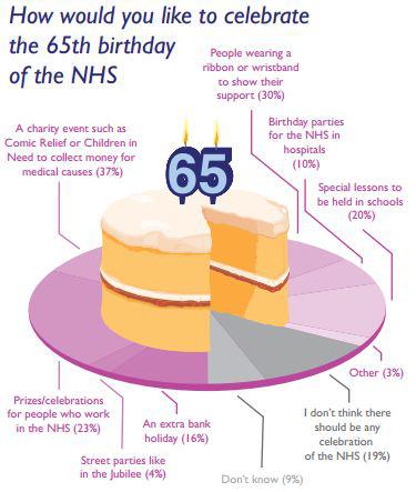
The first is this pie chart which, not content with testing readers' eyesight by colouring each segment a similar shade of pink, and their maths by totalling more than 100%, actually went on to obscure a decent chunk of chart by placing a large cake in the centre:
Days later, we came across this graph from a law firm claiming to show a sizeable increase in the cost of redundancy payouts.
Join 74,000 newsletter subscribers who trust us to check the facts
Sign up to get weekly updates on politics, immigration, health and more.
Subscribe to weekly email newsletters from Full Fact for updates on politics, immigration, health and more. Our fact checks are free to read but not to produce, so you will also get occasional emails about fundraising and other ways you can help. You can unsubscribe at any time. For more information about how we use your data see our Privacy Policy.
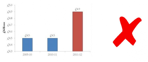
Casting an eye over this graph, you might be fooled into thinking that payouts had almost trebled over the previous year. After all, the red bar is almost three times as large as the blue ones.
Take a closer look at the scale however and you'll notice that we're dealing with a narrower range of values than it might at first appear. Start the y-axis at zero, as we have on the right, and the increase in payouts suddenly looks much less impressive.
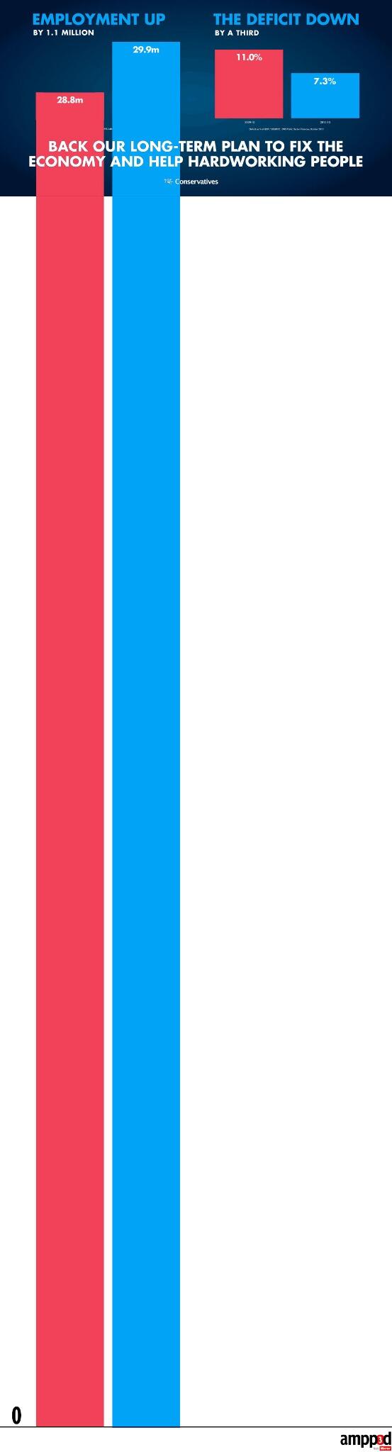
Similarly, this offering from the Conservatives seems to show employment in 2013 several times higher than it was in 2010:
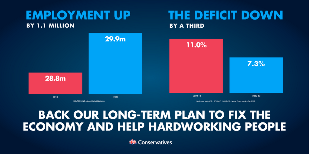
But as Mirror's new site ampp3d pointed out, the graph would look strikingly different if we actually started counting from zero:
Labour has also struggled with scale when it comes to its graphs, as we saw in yesterday's resolution, and we showed off a few more bad practices in How to make bad charts in seven simple rules.
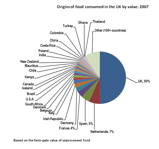
It hasn't been all bad news in 2013 for graph-lovers, however. We've previously pointed out this jumble of a pie chart from Defra:
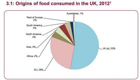
Take a look at this year's edition of the same publication however, and you'll notice that the same information has been presented in a much more sensible way:
We hope that in 2014, all those making graphs will take a little time to think about how the information can be accurately and fairly presented. That's one reason why Full Fact does work with the Office for National Statistics and Government Statistical Service on how they communicate official statistics.