Is the UK trading at its biggest loss for decades?
"We have got to sort out the balance of trade deficit that we have. It was £58bn in 2012, that's the highest that it's been since 1989."
Chuka Umunna, Sky News, 30 June 2013
After a week in which Chancellor George Osborne set out the Government's 2013 Spending Review, attention turned over the weekend to the UK's fortunes on the international stage.
Supporters of the Government have made much of recent statistics showing the UK is now exporting more cars than it's importing, but yesterday Shadow Business Secretary Chuka Umunna poured cold water over that, pointing out that, on the whole, we're spending more money than we're making in the trade market.
Join 72,953 people who trust us to check the facts
Sign up to get weekly updates on politics, immigration, health and more.
Subscribe to weekly email newsletters from Full Fact for updates on politics, immigration, health and more. Our fact checks are free to read but not to produce, so you will also get occasional emails about fundraising and other ways you can help. You can unsubscribe at any time. For more information about how we use your data see our Privacy Policy.
What on earth are you talking about?
The Shadow Business Secretary is referring to what's called the UK's 'balance of payments'. Put simply, this is a measure of economic transactions between UK businesses and the rest of the world, such as exports and imports of goods and services, investments into and out of the country, and funds transferred into or out of the country as a result of aid, military assistance, or simply being part of a larger body such as the EU.
Taking trade imports and exports in isolation, the mechanism is simple: if the value of what we sell abroad is greater than the value of things we buy from abroad, we run a 'balance of payments' surplus. If not, we're running a deficit.
The graph below demonstrates how Mr Umunna's £58 billion (now revised to £59 billion) is broken down into trade of goods, services, income (investments in and out) and transfers (payments due to aid or membership of an institution such as the EU):
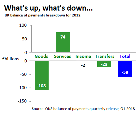
Evidence from the ONS suggests the Goods deficit is fuelled by large deficits in the foods, drinks and tobacco trade and in manufactured goods. Meanwhile, services trade does well, predominantly due to financial services which in 2011 accounted alone for more than half the services surplus. Furthermore, the deficit in transfers is largely down to EU institutions which, in monetary terms, took £9.5 billion more than they gave in 2011 (the latest year for which the breakdown is available).
So where do we go for more information?
The answer is pink
For stats like these we need to consult the 'pink book' which is where the Office for National Statistics (ONS) compiles it's statistics on UK trade. They publish more regular updates in their 'balance of payments' quarterly releases. Both sources allow us to compile figures for the UK's 'balance of payments' since 1946.
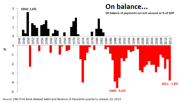
Sure enough, the Shadow Business Secretary alludes to a relevant issue. The UK's balance of payments deficit of £59 billion in 2012 is the highest monetary deficit on record, but a more relevant historical comparison puts this in terms of GDP.
From this we're left in no doubt that the balance tilted to the biggest deficit since the 1980s in 2012:
So why do we now tend to import more than we export?
Every individual aspect of the UK's trade can be put under a separate microscope to explain why the overall balance of payments has struggled for the last three decades. The ONS provide some explanations as to why this might have happened. They characterise the trend up to 2007 in these terms:
"The large and prolonged turnaround in the trade balance was driven by a sharp rise in the growth of imports of goods and a fall in the growth of exports of goods. In contrast, exports of services continued to grow faster than imports. Overall, exports of goods and services grew by an average 1.2 per cent each quarter during this period, but imports by a higher rate of 1.6 per cent."
The ONS mainly puts this down to two factors: economic growth itself leading to higher household expenditure and demand for foreign goods and a 'boom' in international competition from emerging economies, particularly China and India. All in all:
"Despite structural changes in the UK economy, and possible effects resulting from movements in sterling, the total trade balance over the last two-and-a-half decades has generally exhibited a strong cyclical pattern. Movements between surplus and deficit have tended to follow the strength of domestic demand."
But this shouldn't necessarily equate to being bad news for the UK. The ONS also points out that, while the UK's trade deficit has widened, the terms of trade improved up to the start of the 2008 recession:
"The terms of trade is simply the ratio of export prices to import prices. An influx of cheap imports have depressed the latter, but export prices, which are concentrated in high-technology manufactures and services have been more resilient despite stronger global competition.
"The improvement in the terms of trade (...) represents a positive wealth effect, as sterling can command a greater quantity of goods and services in global markets."
All in all
Chuka Umunna's figures are correct and he rightly points out that the UK's trade deficit is at its highest since the 1980s. But we shouldn't necessarily jump to call this bad news - as the ONS have pointed out the actual terms of trade have seen improvement over the last decade, and in the past a trade deficit hasn't necessarily coincided with a struggling economy.