'Our jobs problem' — what a difference a graph makes
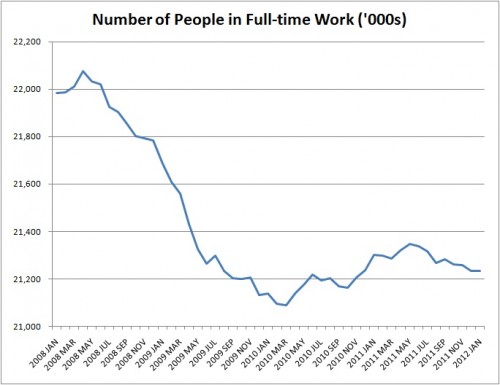
A dramatic graph of the number of people in full time work was recently published over at Liberal Conspiracy, under the banner of 'Our jobs problem summed up in one chart'. Here it is:
And, at the suggestion of Full Fact reader Bob MacCallum, this is what happens if you adjust the axis to start at zero (which makes changes up and down seem less dramatic) and add the context of the preceding years. We've put a box around the bit covered by the Liberal Conspiracy graph to make the comparison more obvious.
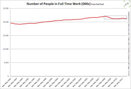
The original data is available from the Office for National Statistics (Table EMP01, series YCBE).