This claim’s source seems to be a poster from 2014 and the figures have changed since. In 2016, according to EU data, six of the UK’s regions were in the bottom ten according to Gross Domestic Product (GDP) per person when comparing against nearby countries.The EU’s statistics agency Eurostat says this is a measure of the economic development of regions, and doesn’t show how rich or poor people living in those regions are.
So this is more a measure of how rich regions are in general, rather than necessarily the people living in them.
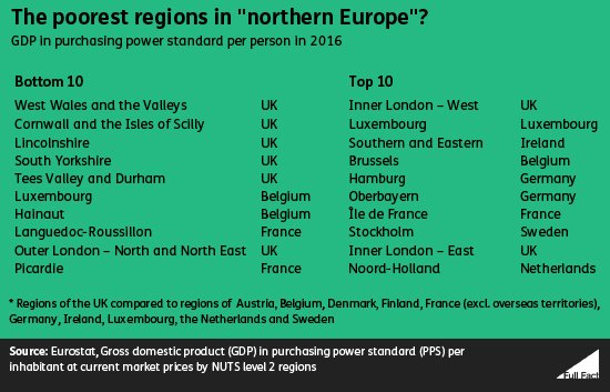
The data measures economic development of different regions
The claim uses data from a poster produced by the Inequality Briefing website in 2014. That used EU data on GDP per person, and adjusted that for price differences between countries.
GDP measures the size of economies, in this case regional economies, but not all of the income produced is claimed by people in those regions. For example, people that live overseas can make investments in London, and then claim income from them.
That means that GDP per person measures the wealth of regions, and Eurostat says it does not “measure the income ultimately available to private households of a region” - i.e. how "rich" or "poor" they are .
Also, when producing the figures, Eurostat adjusts GDP for price differences between countries, so you can compare the economic activity of different regions, regardless of their price levels. But this amount is set at a national level, so doesn’t account for the fact that price levels in some regions may differ from other regions within the same country (London is a much more expensive place to live than the rest of the UK, for instance).
So some regions with price levels lower than the national average may appear poorer than they actually are, and vice-versa.
The analysis compares the UK regions against nearby countries
The Inequality Briefing poster compared UK regions to other regions in “northern Europe”. Specifically that’s regions in Austria, Belgium, Denmark, Finland, France, Germany, Ireland, Luxembourg, the Netherlands and Sweden.
The analysis also excludes overseas territories (such as some of France’s overseas territories in the Caribbean which would otherwise be included in the bottom ten).
Inequality Briefing say they chose those countries as they’re economically similar and nearby.
What you include in “northern Europe” is subjective but, for instance, the UN includes the Baltic nations (Estonia, Latvia and Lithuania) in the category of “northern Europe”. All these countries would be in the bottom 10 regions for GDP per capita, if included. The UN also includes countries not covered by the EU data, like Iceland, in northern Europe and exclude countries including Germany and France (they’re in “Western Europe”).
Going beyond northern Europe to other high-income EU countries, Spain and Italy have regions with lower GDP per person than the poorest UK regions.
This map shows how GDP per person varies across the EU, the more red a region is the further below the EU average it is in terms of GDP per person, the more green it is, the further above the EU average.
Wealth across the EU
GDP per person as a percentage of EU average (purchasing power standard) in 2016
Source: Eurostat, Gross domestic product (GDP) in purchasing power standard (PPS) per inhabitant at current market prices by NUTS 2 level regions.
If you use a different set of regions, the UK has four of the top ten poorest regions
Another caveat to this data is that it compares regions of a certain level.
At that level, the UK has six of the ten poorest regions among those northern European countries. Looking at a higher level with larger regions, the UK has four of the poorest ten regions, again excluding the French overseas territories.
Also, in the Inequality Briefing analysis, the regions in the UK are smaller in population than in some other countries, including France and Germany. Having smaller regions increases the likelihood that you get wider variation between the richest and poorest regions.
For example, London is split into five sub regions. That means that you can see the wealth difference between the richest bit of London, (Inner London – West), and the poorest bit of London (Outer London – East and North East).
But not all cities are split like this. For example, at this regional level, the largest region is the Ile-de-France with 12 million people. This includes Paris, its suburbs and surrounding areas. The GDP of this region isn’t split down further. So we can’t know whether, for example, the outskirts of Paris are poorer or richer than the outskirts of London.
Ultimately, is the UK more unequal than other nearby countries?
The poster from Inequality Briefing gives the impression that UK is an economically unequal country compared to peers. We have the richest region but also many of the poorest. For the reasons above, it’s difficult to say that GDP per person is good at measuring how rich and poor people are between different areas. But other measures do suggest the UK is more unequal.
For example, the gini coefficient measures disposable income inequality on a scale from 0 to 100. A score of 100 would mean that everyone’s incomes were totally unequal, with all the money going to one household. Zero would mean everyone lived on effectively the same income.
According to that metric, in 2016 the UK was more unequal than those other 10 countries in northern Europe.