Fifty years of income inequality
We produced this video in collaboration with the Institute for Fiscal Studies. You can find more detail in their report on Living Standards, Poverty and Inequality in the UK: 2016
We're richer than we were 55 years ago and fewer people live on very low incomes.
But the gap between rich and poor is much larger.
The graph in this video is one way to show the change.
The bottom line shows a scale that goes from £0 to £60,000 a year. The line going up the left hand side shows the number of people at each level of income.
Join 74,000 newsletter subscribers who trust us to check the facts
Sign up to get weekly updates on politics, immigration, health and more.
Subscribe to weekly email newsletters from Full Fact for updates on politics, immigration, health and more. Our fact checks are free to read but not to produce, so you will also get occasional emails about fundraising and other ways you can help. You can unsubscribe at any time. For more information about how we use your data see our Privacy Policy.
Better off and less equal
The graph shows final incomes after tax and benefits. It includes both wages and other sources of income, like pensions or shares.
The data comes mainly from the Family Resources Survey (or its earlier equivalent) looking across Great Britain from 1961 to 2015.
The incomes for different households have been adjusted to match the number of adults and children who live there. They’ve been presented as the equivalent income for a childless couple.
Back in 1961, four out of five people had a household income that was equivalent in today's terms to between roughly four and a half and fifteen and a half thousand pounds per year for a childless couple.
By 2015, four out of five people had an income equivalent to between twelve and fifty thousand pounds a year for a childless couple.
1960s and 1970s
The 1960s and 1970s generally saw incomes grow. The bulk of households move towards the right hand side of the graph, showing they have higher incomes.
But the spread of incomes remained pretty similar, suggesting similar levels of inequality throughout the 1960s and 1970s.
1980s
By way of contrast, the 1980s saw rapid income growth and also a sudden rise in inequality.
You can see household incomes become more spread out in the graph. At the same time, many people moved on to much higher incomes and the number on very low incomes fell.
1990s and 2000s
Incomes continued to grow through the 1990s and 2000s, and this continued up until the 2008 recession.
The spread of incomes didn't change much more. Similar levels of inequality to the 1980s have persisted through the 1990s and 2000s.
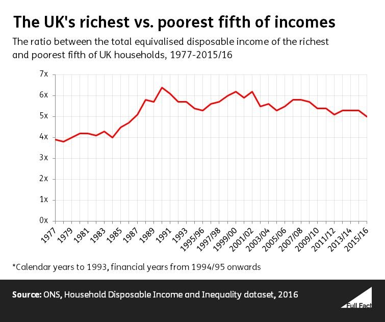
Different measures, similar stories: the Gini and the 80:20 ratio
The graph below illustrates the same story by two other measures.
This red line compares the richest fifth and poorest fifth of households since 1977. The higher ratio means a bigger gap between rich and poor.
A score of one would mean that incomes were totally unequal, with all the money going to one household. Zero would mean everyone lived on effectively the same disposable income.
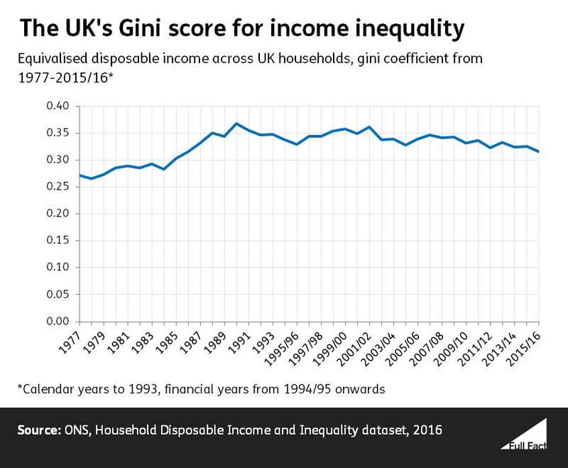
The Office for National Statistics summarises that there has been a gradual decline in income inequality over the past decade.
At the same time, the proportion of people in poverty has either been stable or fallen slightly, depending on the measure you choose. We discuss this in our guide to the facts and figures on poverty.