Have wages fallen in all but one month of Coalition government?
"For the 39 months that David Cameron has been Prime Minister, in 38 of them prices have gone up by more than wages." Yvette Cooper on Question Time, 3 October 2013 (42:40)
This article was updated on 16/10/2013. See below.
Labour has repeatedly challenged the government's line that the economy is recovering by claiming that living standards have been falling for 38 out of the Coalition's 39 months in power.
The claim was repeated by Yvette Cooper on Question Time and by Ed Miliband at last month's PMQs.
Join 74,000 newsletter subscribers who trust us to check the facts
Sign up to get weekly updates on politics, immigration, health and more.
Subscribe to weekly email newsletters from Full Fact for updates on politics, immigration, health and more. Our fact checks are free to read but not to produce, so you will also get occasional emails about fundraising and other ways you can help. You can unsubscribe at any time. For more information about how we use your data see our Privacy Policy.
So does this claim check out?
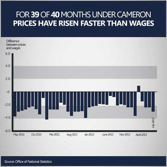
The graph Labour posted on the party's Facebook page seems to offer some context to Yvette Cooper's claim on Question Time:
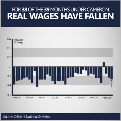
*(The figures shown on the Y axis are off by a factor of 10. This was confirmed to us by Labour, so 0.2% should be 2%, 0.4% should be 4%, and so on.)
Real wages and inflation
What Yvette Cooper said and what is graph claims to show are actually different things.
What the graph shows is the difference between how much prices have changed since the previous year (taken from the ONS's release on consumer price indices), and how much wages have changed (based on the ONS's release on Average Weekly Earnings) over the same period.
This isn't the same as real wages. Real wages are calculated by taking wages in cash terms and adjusting their value by accounting for the changes in a price index (which is what we did in the graph below). This means that the value of the average wage in July 2013 can be expressed as if there had been no inflation since May 2010.
When asked to comment on this last point, a Labour spokesperson - whom we contacted in the course of our research - told us:
"Given that real wages are earnings taking account of inflation we think this is a reasonable title to illustrate the point the graph makes."
The reason we should be cautious about accepting Labour's explanation that this can be used as a proxy for real wages is that the change in wages is relative to the previous year. So the May 2010 data in the graph represents the change in the value of the average wage from a May 2009 baseline, and so on.
As we can see below, when we use the standard method for calculating real wages (deflating the nominal average wage using the same measure of inflation as Labour did, so that its value is expressed in constant, May 2010 prices) the picture is quite different:
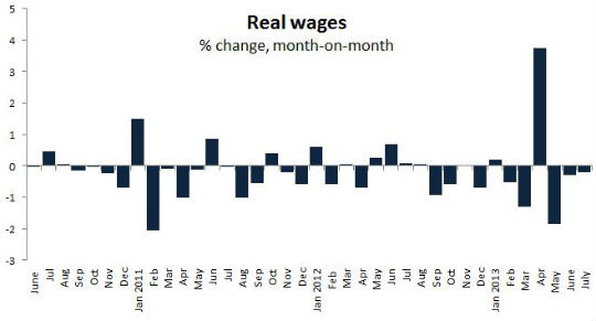
*(This graph only shows data for 38 months. As we are showing month-on-month changes in real wages under the Coalition, we used May 2010 as our baseline.)
Measures of inflation
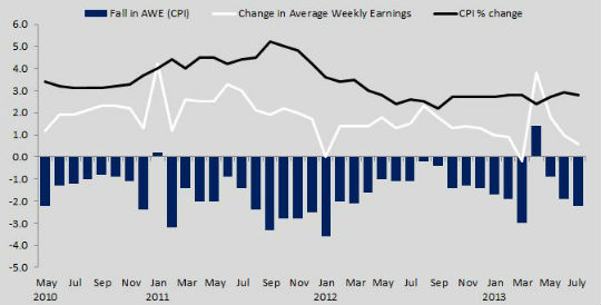
A further problem with Labour's graph is that it uses RPI as its measure of inflation, which is no longer a national statistic. The ONS withdrew it this year because, in the Financial Times' economics editor's words, "when prices do not change, the RPI will normally show positive inflation."
The ONS then replaced it with RPIJ, which is currently undergoing evaluation. As it happens, if we use RPIJ instead of RPI the results aren't any different: RPIJ also shows that for 38 out of 39 months since May 2010, wages grew by less than inflation.
Normally, earnings are adjusted for inflation by using the Consumer Price Index (CPI), although an argument can be made for using either.
Wheareas RPI and RPIJ include housing costs such as mortgage interest payments and council tax, they exclude other services covered by the CPI, such as charges for financial services. Both RPI and RPIJ don't take into account the expenditure of households whose income is within the top 4% and pensioner households which derive at least three quarters of their total income from state pensions and benefits.
If we were to change Labour's graph to use CPI instead of RPI, the fall in living standards would apply to 37 out of 39 months.
So provided we use RPI - or more properly RPIJ - as the main measure of inflation, Yvette Cooper's claim that prices have gone up more than wages for 38 out of the 39 months of the Coalition's government does check out.
How has this affected the labour market?
There is one final point on the fall in wages. Some economists have pointed out that it may not always be bad news. For example, NIESR's chief economist Simon Kirby, made the point that "if wages had kept pace with inflation, a large number of people would have been better off, but a large number of people would have lost their jobs and unemployment would have been higher. It's a trade-off."
---
Flickr image courtesy of 401(K) 2013
UPDATE 09/10: We updated the text about the first graph to refer to the change in prices (which is measured by inflation) rather than the change in inflation. We also updated the text about the final graph to quote Yvette Cooper's original claim more specifically.
UPDATE 16/10: Since the time of writing Labour posted a new graph on the fall in wages compared to prices. As we can see the Y axis now shows the correct figures, and rather than presenting it as "real wages", the data is now correctly identified as showing the "difference between prices and wages".