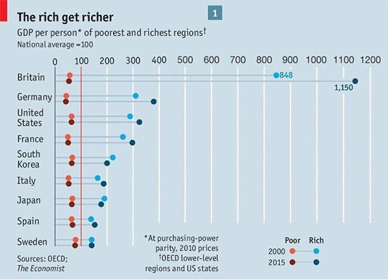
The rich get richer, according to a chart from the Economist in 2017. It’s now being shared widely on Twitter, so we gave it the Full Fact treatment.
The data used to make this graph is largely technically accurate, but it’s comparing very unequal geographic areas so it’s not a fair comparison.
It makes the UK look like it has a much bigger gap between its richest and poorest regions than all the other countries in the graph; in fact this gulf between the UK and other countries is more a result of how the data is collected, rather than showing the actual regional inequality people experience.
The UK’s income inequality is about average for similar high-income countries when using another measure.
This is local GDP, but not all for local people
The chart shows the Gross Domestic Product (GDP) per person across different regions and countries in cash terms, not accounting for inflation (the Economist confirmed to us that the “2010 prices” footnote was a typo).
GDP measures the size of economies, in this case regional economies. But not all of that money necessarily goes into the pockets of the people living there. For example, people that live overseas can make investments in London, contributing to the size of London’s economy without being part of London’s population.
That means that GDP per person measures the economic output of regions divided by the number of people that live there, not how rich people in those regions are.
The chart says it looks at the change in regional inequality between 2000 and 2015. That isn’t always the case. The Economist confirmed to us that the 2015 data was actually from 2014 for all the countries except the USA and the UK (2015 data) and Japan (2013 data).
Some of the data used by the Economist when they originally published the graph seems to vary slightly from the data currently published online by the OECD, but the differences are very small.
We’ve asked the OECD for more detail on their data and whether any of the figures have been updated in the last year.
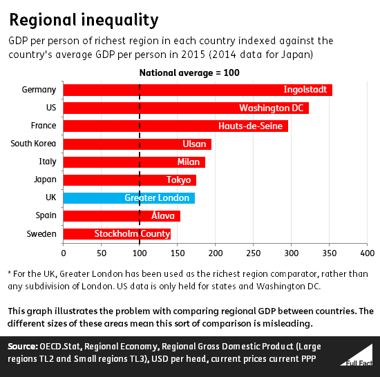
Size matters
For this sort of comparison to be meaningful and fair the regions in each country need to be of similar size and characteristics.
Unfortunately they aren’t. The UK’s richest region is the City of London and Camden, essentially the capital’s financial district and an affluent central borough. But the data published by the OECD isn’t that granular for all countries. Of the nine countries listed in the graph, the UK is the only one for which sub-city breakdowns are available.
A fairer comparison would be between, say, this region and other similarly sized areas (for example Manhattan) rather than the comparison made by the chart.
It might seem that arguing about geographic boundaries is splitting hairs but it’s fundamental to understanding the data. Imagine the City of London and Camden region itself was split down further into “the City” and “Camden”. The City would be the region with by far the biggest GDP per capita (given that it contains the UK’s financial district and houses very few people). So, by the GDP per person measure, the UK would look even more unequal than the chart above suggests, even though the country would be no different in reality.
In the absence of sub-city data for other countries, we can flip the problem on its head, by comparing London as a whole to other countries’ richest regions of similar size.
Looking at London as a whole
Taking Greater London as a whole as the UK’s richest region delivers markedly different results.
By this measure the UK’s regions are unequal, but not as dramatically and certainly aren’t the most unequal compared to those other countries the Economist looked at.
This isn’t a perfect comparison either and perhaps goes too far the other way. Greater London is a very large area—larger than other countries’ richest regions.
For example France’s richest region is the part of the suburbs west of Paris. If these were combined with the other suburbs and Paris itself, into one region, then France would look more equal than the above chart suggests.
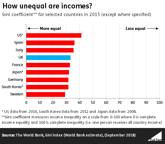
There are simpler ways to understand inequality
For the reasons stated, using regional GDP per person to talk about inequality has its limits. Other measures suggest the UK’s inequality is about average compared to similar countries.
For example, the gini coefficient measures disposable income inequality on a scale from 0 to 100. The World Bank publishes figures on the gini coefficient of individual countries.
A theoretical score of 100 would mean that everyone’s incomes were totally unequal, with all the money going to one household (complete inequality). Zero would mean everyone lived on effectively the same income (complete equality).
Compared to the countries mentioned in the Economist graphic, the UK’s gini coefficient is fairly average. Incomes are more equal than in Italy, Spain and the United States (which has by far the highest income inequality). But the UK is less equal than France, Sweden and Germany (while data for South Korea is only available up to 2012).