The scale of UK sickness absence
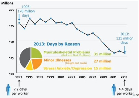
Yesterday, Penny Young from NatCen (the National Centre for Social Research) tweeted about a chart which had irritated her. It's from a BBC article on the effect sickness absence has on the economy and uses ONS Labour Market data.
It looks like the number of sick days in 1993 is almost three times higher than in 2013, when it isn't — it's 1.4 times higher. The chart starts at one hundred million, rather than zero, which exaggerates the change.
The pie chart showing reasons for days off sick also misses out an important category. It doesn't include sick days when people chose not to give a reason for their absence. Pie charts should always show proportions of a whole and missing out this category means the three reasons with coloured segments take up more of the pie than they ought to.
Join 73,000 newsletter subscribers who trust us to check the facts
Sign up to get weekly updates on politics, immigration, health and more.
Subscribe to weekly email newsletters from Full Fact for updates on politics, immigration, health and more. Our fact checks are free to read but not to produce, so you will also get occasional emails about fundraising and other ways you can help. You can unsubscribe at any time. For more information about how we use your data see our Privacy Policy.
Update (4 March 2014)
The chart in the BBC article was originally published by the Office for National Statistics in its sickness absence release.
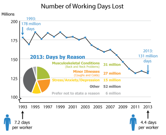
We've been in touch with the ONS to highlight the problems with it. In response they've made changes to the way the chart is presented:
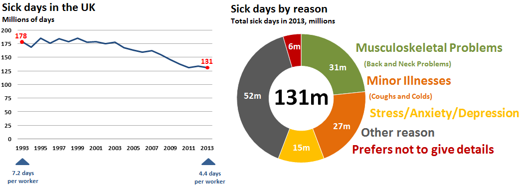
Now the pie chart includes those people who preferred not to state a reason for their absence from work. They could be part of the 'big three' reasons for absence and prefer not to disclose this, or they could be off sick for a different reason. In either case, it makes the information clearer to set this out as a category in its own right.
The y-axis is still 'zoomed in' but it's now slightly clearer that it has been compressed. The labels on the chart itself help readers to see the exact size of the fall.
It's great to see the ONS correct a graphic after complaints are made about its clarity and that the BBC have now followed suit and replaced the chart in their article with the updated version.


