Tax dodging and benefit grabbing: the scale of the problems
This article was updated 8/7/13. See the bottom for details.
'Infographics'. They're now everywhere on the internet. From Google searches to Twitter and Facebook feeds, it's increasingly difficult to avoid the attempts of others to make sense of the world through the medium of a few pretty bars and bubbles.
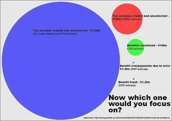
Except, sadly, some of them aren't very good at it. This graphic has been circulating Twitter recently, which attempts to visualise the comparison between fraud, overpayments, unclaimed benefits and uncollected tax in the UK:
Join 73,000 newsletter subscribers who trust us to check the facts
Sign up to get weekly updates on politics, immigration, health and more.
Subscribe to weekly email newsletters from Full Fact for updates on politics, immigration, health and more. Our fact checks are free to read but not to produce, so you will also get occasional emails about fundraising and other ways you can help. You can unsubscribe at any time. For more information about how we use your data see our Privacy Policy.
The message you're intended to get as a reader is that the £120 billion bill from "tax avoided, evaded and uncollected" is, compared to everything else, a whopper. It's apparently four times as much as another estimate for the same thing (the red bubble using HM Revenue and Customs [HMRC] data).
But is that blue bubble really four times as large as the red bubble? No, it isn't. In fact, the graphic puts it at more like fourteen times as large. As a reader, you'd be forgiven for getting a skewed sense of how big the problem of tax evasion and avoidance is estimated to be, compared to everything else.
Graphically inflating problems is only half the issue however when the figures themselves don't necessarily stand up.
We have to remember for instance that estimates of the tax gap from HMRC have, in their own words: "many sources of potential error and uncertainty".
As well, £120 billion and £30 billion estimates for tax evasion and avoidance can't both be right, and neither is going to be reliably close to the mark anyway. Tax Research UK are behind the £120 billion estimate, arguing HMRC's stats are faulty. In return, HMRC argue the former's stats are based on faulty assumptions.
We also know the Citizen's Advice Bureau's (CAB) figures are old, and they're now putting this at £20 billion. Half of this can be accounted for at least from estimates of how much in means-tested benefits goes unclaimed (we've asked CAB for the other half).
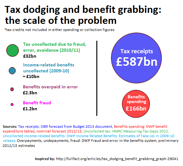
So, in keeping with Full Fact's own recent practice, we've made an improved version:
UPDATE 8/7/13 19:51:
Andrew Fisher, creator of the original graphic, had previously replaced it with an updated version showing accurate areas, so if you're using the version we saw you're behind the curve. Hat tips both to Richard Simcox for making the connection and to Andrew for the quick response.
The Full Fact version above uses more current figures where available and omits the criticised independent estimate of the tax gap at £120bn, so the two images are not directly comparable.