What's happened to living standards?
- There's no single measure of living standards. Different measures look at different groups of people, different income sources and adjust for inflation in different ways.
- Wages are growing in real terms, but by most measures they're lower now than they were at the start of the Parliament.
- However, other sources of income and the level of employment also matter. Overall, average household incomes will probably be higher this year than they were at the election.
- Changes in average incomes don't represent everyone's experiences. Some people will be earning more than they did in 2010.
Labour say that people are £1,600 worse off. That tax and benefit changes have cost people £1,100 a year, and that living standards have fallen for 5 years.
The Conservatives beg to differ. They say that living standards are higher than they were and that wages are growing. So what's actually happening?
Wages are growing now, but by most measures they are lower now than they were at the start of the Parliament. But only looking at wages ignores changes in other types of income—and employment.
If we look at the broader picture, the director of the Institute for Fiscal Studies says that "average household incomes have just about regained their pre-recession levels. They are finally rising and probably will be higher in 2015 than they were in 2010".
There's no single measure of living standards
There are a wide range of living standards measures available: the UK Statistics Authority has identified 15 different reports on UK incomes.
Different measures look at individuals, households, the sum of all households. Some follow people in continuous employment, and others don't follow individuals at all, just looking at the average at a given time. Measures might include taxes and benefits or just look at wages.
Couple this with the range of inflation statistics available and it's hard to shake the conclusion that perhaps we have more measures than we need. An unfortunate consequence of this sprawl is that that we've reached a point where it's almost always possible to find a figure supporting the point you want to prove.
The guide below tries to unravel some of the main figures thrown around.
When we talk about income and living standards, we care about what people can buy. The figures below take changing prices into account by adjusting them for inflation—they look at the change in real income.
The effect of coalition policies
Shadow Chancellor Ed Balls claims that households are £1,100 worse off because of changes made by the coalition.
This figure comes from the Institute for Fiscal Studies, which says that the average impact of the tax and benefit changes has been to lower household incomes by £1,127 a year. You can read our full article on this here.
This is measured relative to a situation where no policy changes were made, and rates and thresholds were (for the most part) uprated in line with a variant of the Retail Price Index measure of inflation.
This doesn't tell us much about individual households. The IFS says that "this average figure disguises considerable variation across households at different income levels and between different household types". Some have lost more, some have lost less, and some may even have benefited.
Not all of the changes were coalition policy: some of the cuts were announced by the previous government, but implemented under this one.
Average weekly earnings
The latest figures on wages come from the monthly Labour Market Statistics released by the ONS. This looks at the average weekly wage (including bonuses), before taxes are taken into account.
Wages are only one form of income—people also get money in the form of interest and dividends, or government benefits—but for many people their pay-packet is their main source of income.
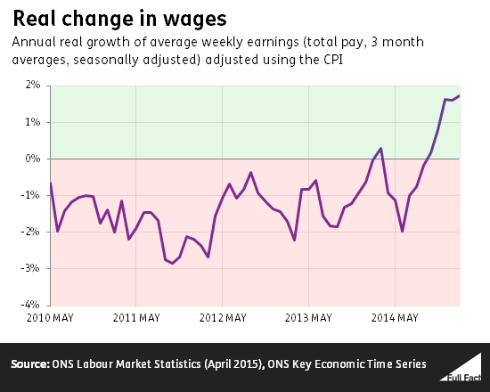
Seasonally adjusted real average weekly earnings (including bonuses) were lower in February than they were at the 2010 election, so on this measure we're worse off.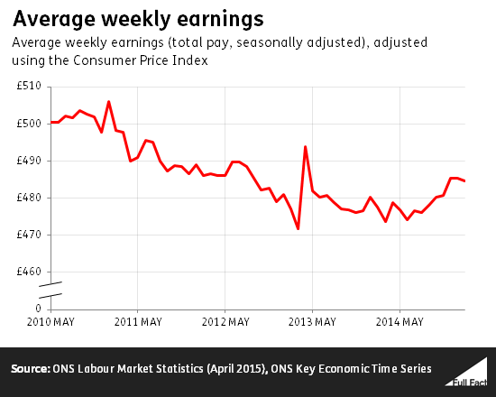
But after four years of falling average wages, things started to look up late last year. A combination of lower inflation and continued cash pay rises meant that workers got a year on year real terms rise for only the second time since the election, and the first sustained period of increases in real wages.
The median wage
This measure looks at the 'middle' wage each year. Half of the people in employment earn more than the median, and half earn less, so it's a good way of thinking about the 'normal'
When Labour says that people are £1,600 worse off, they're talking about the fall in the weekly median wage, multiplied by 52. You can find our full article on this claim here. The ONS changed the way it produces this series in 2011, so figures aren't directly comparable.
Labour have accounted for this change by chaining the series together at the break, which allows us to give a ballpark figure for the change in the median wage.
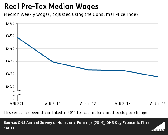
The median is what the 'middle earning' person is paid, before taxes and benefits. This data is a bit older, and comes from April 2014. It's accurate to say that the median employee earned less in April 2014 than they did in April 2010, but this measure doesn't tell us much about the current trend.
As the chair of the UK Statistics Authority has pointed out, the change in the median wage "does not typically represent the pay rise that most people in employment would actually experience during that period".
The median looks at the middle earning person, but as the group of people in employment changes the 'middle' income can fall even when everyone in continuous employment gets a pay rise.
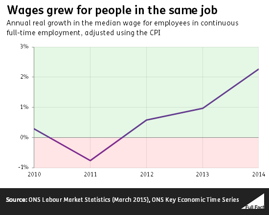
It's also worth noting that the median wage for people in the same full-time job over time has grown above inflation almost every year since 2010. This measure generally shows a higher growth rate in wages because it follows the same people over a year; they gain experience and tenure in this period, which would tend to increase their wages.
Shared flaws
Both of these measures look at average wages. Unemployed people moving into work can lower growth in these measures. For an index used to talk about economic wellbeing, this is quite undesirable. This happens when they take lower paid jobs, even though they increase their own earnings by doing so.
Secondly, the wages of self-employed people aren't included. As the self-employed account for about 15% of people in employment, this is a fairly large omission.
Real GDP per head
GDP is a measure of the value of what the UK produces. This can grow simply because there are more people in the country, so looking at GDP per person gives an idea of what sort of living standards are possible.
However, not all of the income produced is claimed by people in the UK. People that live overseas can make investments in the UK, and then claim income from them.
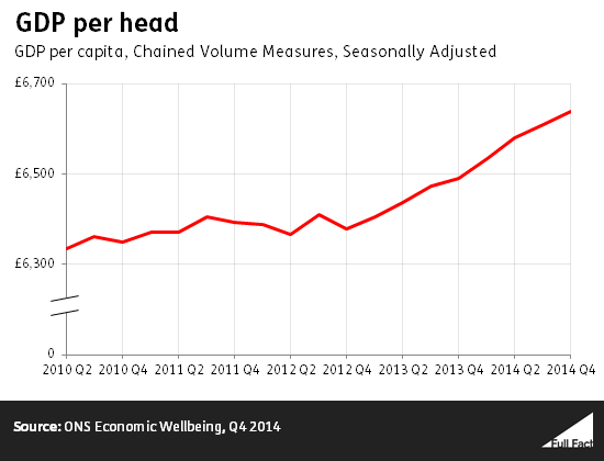
Real GDP per head has grown fairly consistently since late 2012, and at the end of 2012 was comfortably above its level at the time of the election.
Real Net National Disposable Income per head
Real Net National Disposable Income (NNDI) per head is an adjusted version of GDP.
Not all income generated in the UK is paid to people that live in the UK. People that live overseas can make investments in the UK, and then claim income from them. Similarly, people that live in the UK can claim income from investment that they've made overseas. NNDI adjusts for this, so it shows the income claimed in the UK each year.
NNDI also adjusts for wear and tear on the vehicles, tools and other equipment used in production.
While maintaining and replacing worn out equipment is a perfectly sensible way to use income, if we increase production but use all of the increase to compensate for increased wear and tear on equipment it's unlikely that we would consider ourselves better off.
By adjusting for wear and tear, real NNDI per head gives a more accurate measure of what we have available to spend.
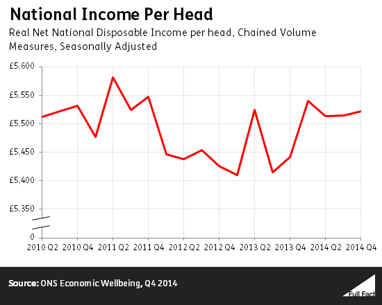
On this measure, the headline figure is that we're slightly better off than we were at the time of the election, but worse off than we were in the quarters to either side. These changes are small, so it's probably fair to say that we're roughly as well off as we were at the last election.
Real Household Disposable Income per head
Not all income is claimed by households. Firms and governments also claim income. Real Household Disposable Income per head only looks at the money that goes to households.
This is disposable income, so it takes away taxes paid and rent or mortgage interest payments made, while adding on cash benefits received from the government.
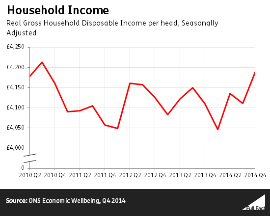
Not all benefits received from the government come in cash form. The government spends a great deal on providing benefits in kind—things like healthcare and education.
If you adjust Real Household Disposable Income to take into account changes in benefits in kind and adjust it for wear and tear in the same way that NNDI is adjusted, then we're worse off than we were at the election.
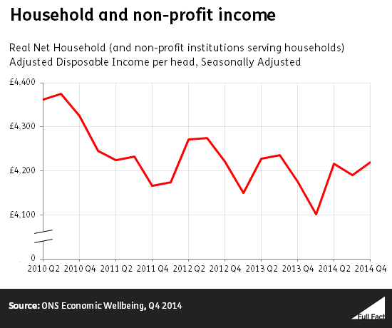
The disadvantage is that this figure includes non-profit institutions whose sole purpose is to serve households, such as charities and universities. While these organisations do contribute to household well-being, including income flowing to universities in a measure of living standards does make the figure harder to interpret.
One number to rule them all?
Trying to capture everything that's happened to living standards in one number is a futile task.
Everything in this article has talked about averages of some kind or another. These don't tell us much about the distribution of income, or the effects on different groups of people. For example, a £1 pay cut hits the poor harder than it does the rich.
Similarly, research has shown that different types of households experience different rates of inflation depending on what they buy. The same cash terms rise for different workers can be a different real wage rise.
Even bearing this in mind, just looking at income doesn't tell us everything about people's standard of living. The Office for National Statistics (ONS) points out a whole host of other things (like access to education and leisure time) matter for wellbeing.
Growth in prices has outstripped growth in wages for the majority of this parliament, and people are substantially worse off than they might have been.
While it is useful to have a figure to refer to in measuring people's experiences, we should be careful not to apply it across all individuals. The use of a single figure to represent all people's experiences inevitably conceals valuable detail.