You're fired! Has it been a record year for redundancies?
"Redundancy payments increased by an estimated 9% in the last financial year to a record £4.9 billion, according to a new report."
The Evening Standard, 28 January 2013
After a week that saw the announcement of dismal GDP figures, the Evening Standard, Daily Star and the Daily Express joined the chorus of those lamenting the poor health of the UK economy. According to each newspaper, the financial year 2011-12 had been a record year for redundancies, with payouts totalling £4.9 billion.
A press release from EMW, a commercial law firm, is the source of the quoted figure.
EMW states that it used data "provided from HMRC" to calculate its statistics. We contacted HMRC to ask whether they produced statistics on redundancy and we're still waiting to hear back from them. Meanwhile, EMW's PR firm informed us that it requested a bespoke dataset from HMRC but it has no plans to share this "proprietary data" and it sees "no further value" in releasing it.
Although we can't link to the source of the headline statistic, it's possible to see what methodology EMW have applied to generate the £4.9 billion number.
EMW's news release states that "410,000 redundancy payments were made by UK employers in 2011-12" and "the average redundancy settlement in 2011-12 was £11,951". This generates a total bill of around £4.9 billion.
However due to the data being unavailable we don't know, for instance, whether these numbers have been adjusted for inflation (which is what we need to make a valid comparison between years).
According to EMW, there were both more redundancies and a lower average payout in 2011-12 compared to 2010-11.
Another problem
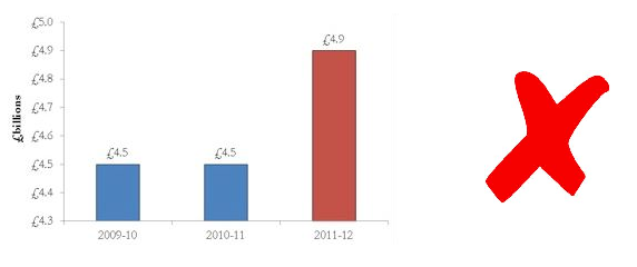
Source: EMW press release
Let's talk about this graph. Looking at it for the first time, you would be forgiven for thinking that the bill for redundancies in 2011-12 was almost triple that of 2009/10 and 2010/11. However, the layout of the graph is completely misleading. For some reason the y axis begins at £4.3 billion, and therefore any change between years is exaggerated. If this axis were to start from zero, we might have a better idea of the size of an increase or decrease.
It isn't difficult to produce the same graph with the same data, but with clearer scaling:
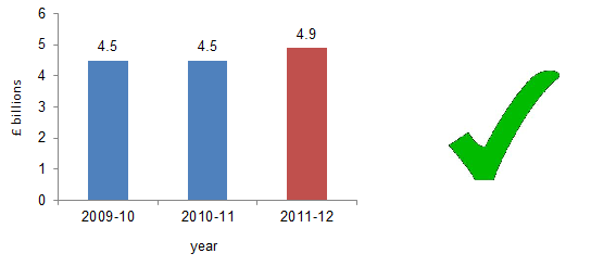
Source: Full Fact, based on visual analysis of EMW press release
This graph did not appear in any of the newspaper articles. However, combined with not having access to the data, when we're faced with an infographic that mispresents a set of numbers, it doesn't help us to have confidence in the figures quoted elsewhere in the same news piece.
The statistics that appear in the EMW press release might be robust. However, until we've seen where the numbers originate from, it's fair to ask why we should trust the numbers that appear in the press.