Update: Following our article, the FT corrected its graph so it now shows, as claimed, the relationship between the estimated infections on the day of lockdown and the total excess deaths, both adjusted for population. We are pleased the FT has made this correction.
The updated graph shows a much stronger relationship between the two variables than the previous incorrect version. This means our analysis focusing on how individual data points might change the overall trend of the graph does not apply so much to the latest version.
However it’s still the case that the graph can’t be used as clear evidence that early lockdowns led to lower deaths. In particular our points on the causal relationship not being evidenced still holds. Also there is still an issue around how countries without excess death data and those countries which did not lock down are considered in the analysis.
“Locking down in the early stages of the spread of the virus is linked to a reduced excess death toll.”
Financial Times, 28 May 2020
The Financial Times (FT) recently published a new analysis comparing the death rates in countries affected by Covid-19.
In particular, the article made two big claims: that the UK had suffered the highest “excess death” toll, relative to its size, of all countries measured, and that there was a link between countries which locked down early and lower excess death tolls.
The first turned out to be wrong due to an unexpected change in another country’s data and, while the second could well be true, the evidence presented is not sufficient to make this claim.
As the FT later said in an amendment to the original piece, the UK has the second-highest, not the highest, excess death toll per person of countries measured, behind Spain.
A new paragraph added on 28 May said: “Until Thursday, the UK had a higher rate of death than in any country for which high-quality data exist[s]. However, Spain made a revision to its mortality estimates, adding 12,000 to its toll of excess deaths from coronavirus in a one-off adjustment to 43,000. This increased its death rate to 921 per million.”
The original claim, now known to be incorrect, has also been published by The Sun and Metro.
On the second claim, the relationship the FT found between lockdown times and the excess death toll is also not as strong as originally suggested, if there is a relationship at all. Even if the lockdown time is associated with excess deaths, that does not mean that one causes the other.
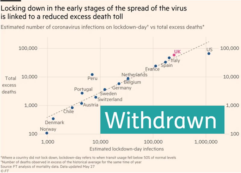
The FT’s graph changed between versions of its article
In the original version of the article, the FT’s graph placed countries according to the number of estimated infections on the day they locked down and the total number of excess deaths so far.
“Excess deaths” are a measure of how many more deaths are happening this year than could have been expected, based on looking at the number of deaths in previous years.
John Burn-Murdoch who co-authored the piece told us the estimated number of infections on lockdown day was not taken from test data. Some countries test more than others, meaning this data isn’t very comparable.
Instead it was calculated by taking the number of excess deaths 23 days after lockdown in each country and retrospectively calculating an infection number (based on an estimated coronavirus infection fatality rate, and using the assumption that the average time between coronavirus infection and death was 23 days).
The FT chose this as a way to express how advanced each country’s epidemic was at the time that it locked down.
The graph showed an incredibly strong relationship between locking down early and keeping excess deaths to a minimum. But that was a bit of a red herring.
Countries with more people are likely, by-and-large, to have both more Covid-19 infections and more excess deaths, so the measurements on the two axes are partly saying the same thing: how many people there are in each country.
So any association between lockdown time and excess deaths was clouded by the fact that the graph was primarily showing that big countries are big and small countries are small.
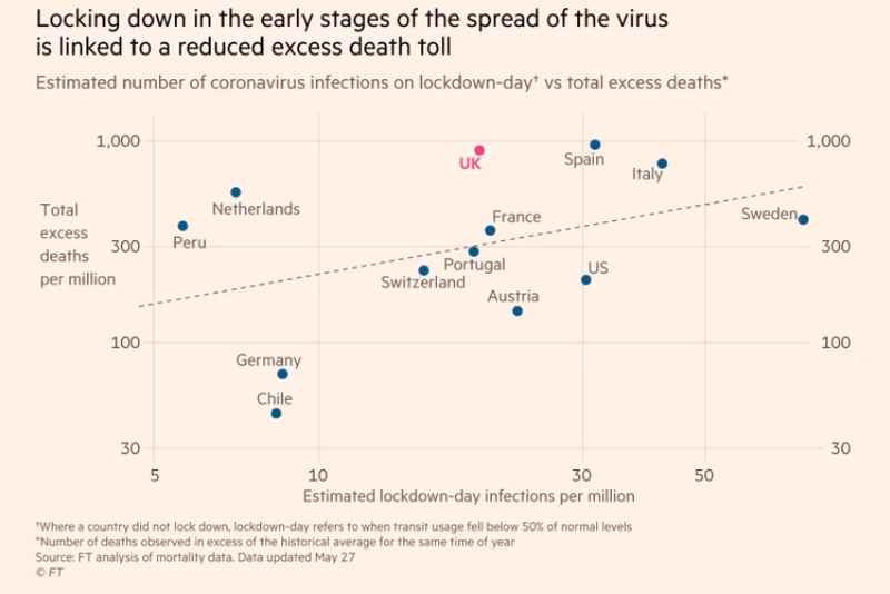
The FT acknowledged this problem, and so republished the graph with both axes now accounting for population size.
Co-author of the piece Chris Giles tweeted: “This removes an element of tautology in the original version, which we regret. It does not change the story.”
The problem is that it did change the story, quite considerably.
Firstly, it's worth noting that when we talked to Mr Burn-Murdoch, he told us the new graph actually still had issues.
He said that while the horizontal (x) axis is supposed to show the estimated number of infections per million people on lockdown day, a data processing error during updating the graph means it actually now shows the estimated number of excess deaths per million people on lockdown day.
Mr Burn-Murdoch told us this was why Belgium, Norway and Denmark disappeared between graph versions—because while they had excess deaths 23 days after lockdown (which is what forms the FT’s estimate of infections on lockdown day), and so appeared on the first version, they did not have any excess deaths at the time of lockdown, so weren’t on the second version.
Following our publication of this piece the FT subsequently corrected the graph which was live until 8 June.
The relationship the FT found isn’t a robust one
We asked the FT to share its data and, while it has published its data on excess deaths, it hasn’t published its data on estimated infections. This means we can’t replicate what the correct figures in the graph should be and so it’s difficult to scrutinise the exact findings.
But at a general level, it’s worth noting the limits to this sort of analysis, especially given it appears that the correlation between total excess deaths and the severity of the outbreak at the time of lockdown is not as strong as suggested by the FT’s first graph.
One issue is that it doesn’t account for the fact that different countries are at different points in their epidemics.
For example, Chile and Germany are the main reasons why the line slopes upward in the newer version of the graph, seemingly justifying the claim that “locking down in the early stages of the virus is linked to a reduced excess death toll”.
But it’s not clear whether Chile’s relatively early lockdown is associated with a low excess deaths figure. Both Chile and Peru are unusual in that their daily death figures are continuing to grow while those in Europe are falling.
If you were to update this graph in a month’s time, it could be the case that, in fact, Chile’s early lockdown did not keep excess deaths down in the longer-run.
What you could be left with is essentially a graph which suggests that the time of lockdown has little association with excess deaths, with Germany being an outlier.
Of course there could be other countries whose data, if included, would actually strengthen the argument made. But this just goes to demonstrate how uncertain it is to claim a clear correlation between excess deaths and lockdown date.
Understandably, the FT said it could only include in its analysis countries for which data on excess deaths exist.
But that leaves potentially significant gaps in the data.
Notably, this sort of analysis struggles to factor in countries which didn’t lock down, which the FT told us it defined as when a country imposed national restrictions on internal movement, according to data collected by the Blavatnik School of Government at the University of Oxford.
For countries that didn’t lock down it used the date at which a country’s transit usage dropped 50% below regular levels, according to Google.
This means that Sweden, a country with a relatively high excess death count but which didn’t lock down, is included on the graph as its transit usage fell below 50%.
But Iceland, which the FT found to have had a very low excess death count and which didn’t lock down, isn’t included on the graph, presumably because Google does not publish data on its transit usage in the same way.
Correlation doesn’t mean causation
Even if the issues highlighted above did not exist in the dataset, there is a fundamental issue with the conclusion made by FT. The statement “Locking down in the early stages of the spread of the virus is linked to a reduced excess death toll” implies that the factors on the graph are causally linked to one another. That is, that total excess deaths are because of the stage at which a country implemented lockdown.
The circumstances that have led to different death tolls across the globe are complex. This correlation between lockdown timing and death toll may represent a true relationship, but that cannot be determined without looking at all the relevant factors.
For example, lockdown timing may be interlinked with other policy decisions such as preventative measures like mask wearing, contact tracing strategies and school closures.
It could also have followed the collective decision of populations to start limiting their movements, as opposed to pre-dating them. It is being assumed that government decisions to lockdown uniformly had an effect on people restricting their movements, when the relationship could have gone the other way.
Mr Burn-Murdoch told us: “Our data, as well as other external analyses, point to lockdown timing being a significant part of this, but it is far from the whole picture. Population density and size also matter, as do age structure, multigenerational households, healthcare resources and many other bits and pieces, and it will take months if not years for the full causal chain to become clear, to the extent that it ever does.”
As regards the demographic factors, using the excess death toll helps to control for some of these, as this measure “is a count of deaths from all causes relative to what would normally have been expected”.
But given the various other factors which could have affected high death tolls, and which weren’t examined by the article, it seems premature of the FT to present the findings of the one association it did examine and claim that: “Examining the cause of the high death rates in certain countries, the strongest link appears at this stage to be between the date of a country’s lockdown and the probable number of infections that already existed when restrictions were applied.”