In an article titled “What they DON’T tell you about Covid”, the Daily Mail published a chart that claimed the number of weekly deaths is currently “barely any higher” than the maximum level from the previous five years.
This is false, and figures the Mail used in its chart are not the real figures.
As pointed out in a Twitter thread by Conservative MP Neil O’Brien, the Mail’s chart claims that in the 44th week of 2020, 10,887 people died, while the maximum number of deaths in the 44th week of the previous five years was 10,861—just 26 lower.
But while the first figure is correct, the second figure is wrong. Figures from the Office for National Statistics (ONS) for deaths registered weekly in England and Wales, which the Mail says is one of the original data sources for the chart, show that the highest number of deaths in week 44 between 2015 and 2019 was actually 10,164 in 2019. That’s 723 lower.
The reason for this difference is that the Mail’s chart claims to be “adjusted for population growth”. However, this adjustment does not seem to relate to any credible figure for actual population growth.
It’s true that the population of England and Wales has grown over these years, which could have the effect of pushing up the total number of deaths. But the figure the Mail gives for deaths in week 44 of 2019 is 6.9% higher than the actual total in that week, which would suggest that they think the population has grown by that amount in one year.
While we don’t have official population estimates for 2020 yet, the total estimated population growth between 2015 and 2019 in England and Wales was just 2.7%, according to figures from the ONS. The average growth per year was 0.7%.
The Mail sources these “adjusted for population growth” figures to a Twitter account called “The Statistics Guy Jon”, although the relevant tweet has since been deleted. The Statistics Guy Jon has not publicly given a detailed methodology for how he produces his population adjusted statistics, but has said on Twitter that he assumes the population in 2020 is 1.8% higher than in 2015, so it is unclear why his figure for deaths in week 44 of 2019 have been adjusted upwards by almost 7%.
Additionally, the Mail’s chart did not use the latest available data for registered deaths, which covers the 45th week of 2020, and shows an even larger increase above the five-year maximum than week 44. This data was acknowledged in the article text, however. (As The Statistics Guy Jon has publicly noted, week 45 shows 2020 deaths above the five-year maximum, even when you apply his supposed population adjustment.)
Since the Mail article was published and following criticism of the figures on social media, The Statistics Guy Jon has "noted an error" and said that he "should have been more rigorous in ensuring [his version of the chart] was deleted".
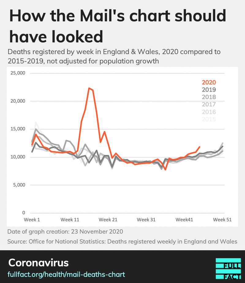
In reality, the number of weekly deaths in England and Wales has been higher than the five-year maximum for the past four weeks, and has been above the five-year average since early September (not adjusted for population growth).
Simply adjusting weekly death figures in line with the overall population size for the year wouldn’t necessarily be the correct approach, as population change is driven by various factors: birth rate, death rate and immigration levels. For example, immigrants tend to be younger and generally healthier than the population as a whole, so would not be expected to increase the death rate to the same degree.
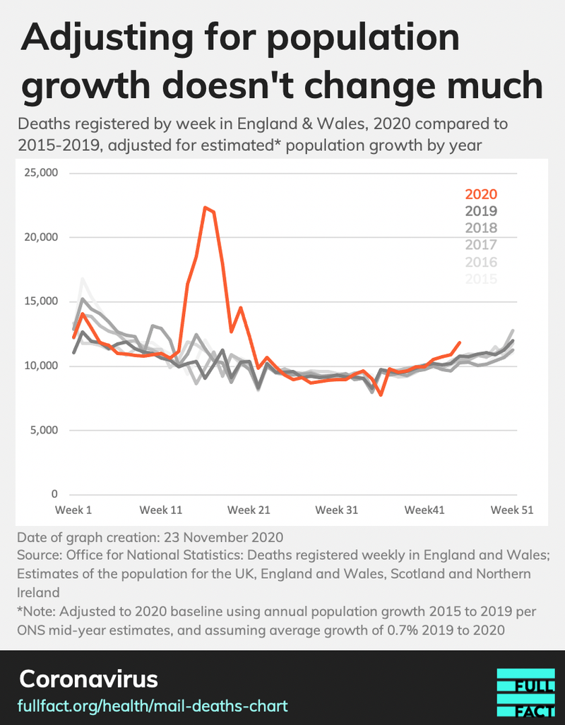
However, even if you do adjust for population growth in this manner (using the ONS estimates for yearly population growth between 2015 and 2019, and then assuming the average growth of 0.7% between 2019 and 2020) then the picture remains much the same—the number of deaths in the past four weeks has still been notably higher than the maximum over the period 2015 to 2019.
As you can see, while weekly deaths are still nowhere near the peak reached during the first Covid wave in the spring of 2020, they have been steadily rising and are now clearly higher than they were in any of the equivalent weeks in recent years.
In addition to the article in which they presented the incorrect chart, the Mail also wrote a follow-up article describing “fury” towards the Department of Health and Social Care, after the department described the original article as “misleading” in a subsequently deleted tweet.