Is the rising cost of public transport leaving us out of pocket?
This article has been updated with more information. See after first graph.
"Rail Fares: Anger As Commuters Face More Hikes"
Headlines like this might as well be cut and pasted onto every new year's front page. Since 2004, regulated rail fares across the country have increased in line with the Retail Prices Index (RPI) plus one percent, and then by as much as five percent more thanks to the government's 'flex policy'. We've explained the mechanics of these increases before.
A similar but less reported 'hike' in public transport fares could just as well be attributed to bus fares, which have also seen consistent rises over the past decade.
Join 72,953 people who trust us to check the facts
Sign up to get weekly updates on politics, immigration, health and more.
Subscribe to weekly email newsletters from Full Fact for updates on politics, immigration, health and more. Our fact checks are free to read but not to produce, so you will also get occasional emails about fundraising and other ways you can help. You can unsubscribe at any time. For more information about how we use your data see our Privacy Policy.
But are these increases eating into our budgets compared to everything else? BBC London this week asked Full Fact to check the numbers out, and they're broadcasting their own analysis on living costs today.
So what has happened to fares, wages and household budgets over the last decade?
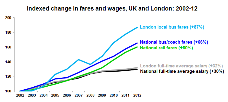
The first place to look is how fares and wages have changed. This isn't difficult - the Office for National Statistics' (ONS) Households Below Average Income (accessible via NOMIS) series shows us that the median full-time salary in the UK stood at £20,376 in 2002 and £26,462 in 2012 - around a 30% increase. Meanwhile, the same wage in London has gone up by around 32% in a decade.
Fares prices - as we might expect - have risen more steeply. There are many different types of rail fare and a number of ways of measuring the increases. Looking at fares as components of the RPI shows that average rail fare prices have increased by around 60% in a decade and average bus/coach fares have increased by 66%.
Looking further to the Department for Transport's bus statistics shows that London's local bus fares have risen by 87% on average.
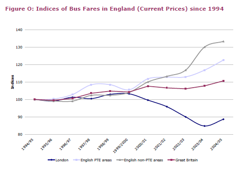
It's worth pointing out that indices (setting all fares to '100' in 2002) can hide some of the underlying data. One of our Twitter followers pointed us to research from the Commission for Integrated Transport which showed how local bus fares in London dipped in the early noughties, and so the rise apparent on the graph above does represent growth from a lower base:
What neither graph tells us is whether - due to price increases in other goods such as petrol, beer and food - households are actually spending more of their budget on fares.
The results are surprising.
The ONS's Family Spending survey can tell us about how the budgets of households in the UK and London have transformed over the past decade.
The chart below shows how, since 2001/02, the average UK household spends its budget:
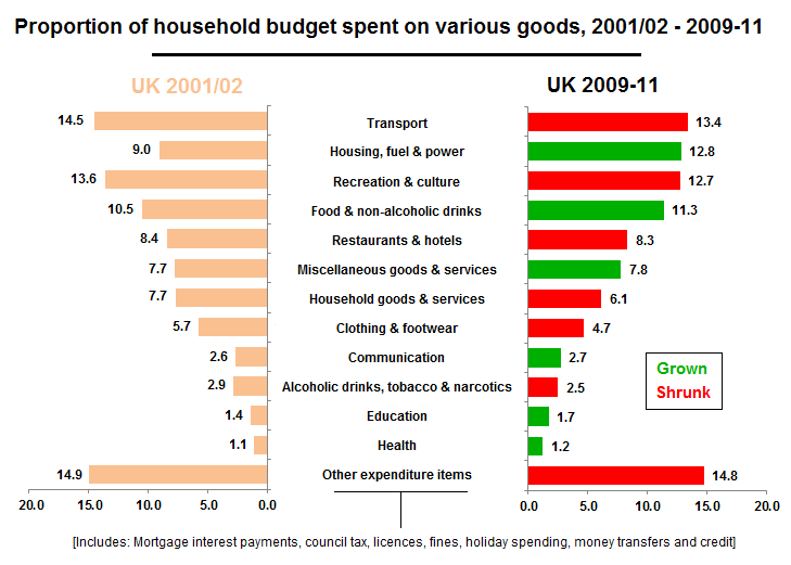
Transport, among other things, has shrunk as a proportion of our entire household spending. But this (13.4%) portion includes all forms of transport - including buying cars and petrol costs. The average UK household spends only 1.1% of its budget on rail, bus and coach fares - much the same as ten years ago.
For London, the picture is similar:
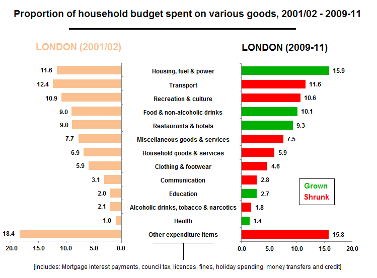
Looking at rail, bus and coach spending in isolation, the average London household in 2001/2 spent £12.80 (or 2.6%) of its budget on these items. Now (2009-11 - the latest available data) the average household spends £13.80 (2.4%) on these fares. Very little different to 2001/2, if anything a slight decrease.
So fares are outstripping wages but we're spending less of our household budget on fares.
Why?
There are a number of reasons why this could be the case. For one, increases in the price of fares for everyone doesn't necessarily mean that everyone will put up and pay the higher fares. Particularly given the economic downturn in 2008, people may be more likely to spend their precious pennies elsewhere.
The charts above back this up. Both the UK and London pictures demonstrate that housing costs - specifically rent prices - have increased by far more than any other household good as rent costs have soared over the last decade. So people may be simply paying more to stay at home rather than put up extra transport costs.
Another reason may be down to increased use of concessionary travel. Department for Transport statistics show that the proportion of all passenger journeys in London over the last five years (since 2007/08) have increased slightly from 31% to 33% of all journeys (concessions such as the Freedom Pass for older travellers).
Further statistics supplied by Transport for London (TfL) show that looking purely at TfL's bus network, the proportion of passengers travelling with either a Freedom Pass or a free Young Person's pass has increased steadily over a decade, and now stands at 31% of all journeys.
In other words, more of us are getting concessions for our travel. So the fares increases on average may be hiding trends either side of the mean - some of us are paying much more, while others are getting concessions.
Without further study, it's hard to put the static household fares budget down to any one of these factors, and indeed more may be at work that we haven't yet studied. The figures nevertheless paint a revealing picture of how our spending has transformed over the decade.