A graph shared on Twitter appears to show that the number of deaths in the UK has risen steeply from 2011 to 2018, after falling for decades.
While the numbers are accurate, using raw figures to look at trends over time can be misleading. After accounting for changes in the size and age structure of the UK population, rates of deaths have remained about the same since 2011.
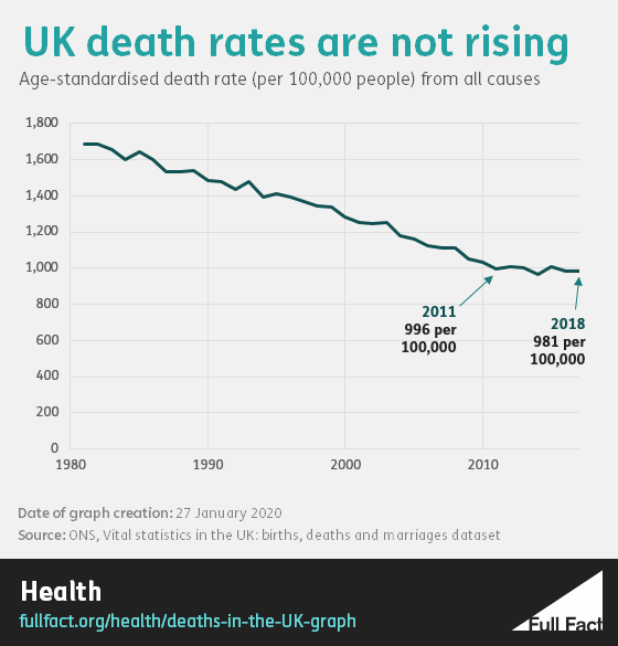
This represents a stalling of the trend after a long period of death rates decreasing and is largely due to changes in the number of people dying from heart disease and stroke, as well as spikes in winter deaths.
Number of deaths on the rise in the UK
The graph shows a period of decline in the number of deaths in the UK from the 1970s to 2010s. This is followed by an apparently steep increase, from 552,232 deaths in 2011 to 616,014 in 2018.
The numbers that are published in this graph are correct. The data originates from official death statistics published by the Office for National Statistics (ONS). When writing about deaths in England and Wales, which made up the majority of all UK deaths, the ONS writes that: “2018 saw the highest number of deaths since 1999”.
However, there are some problems with the data presented in the graph. Firstly, the vertical axis on the graph may mislead readers. The number starts at 520,000 rather than zero. This can have the effect of exaggerating the presented trend.
Secondly, the numbers do not account for the age and size of the population, which means the figures could be misleading.
Adjusting for population size and age structure
The population of the UK has been steadily getting older as people live longer and fewer babies are born.
An older population means that there are more people living with long-term conditions, which make them susceptible to flu and other winter risks.
We’ve produced our own version of the chart from ONS mortality rates, which accounts for these factors. This shows that the rate of death remained at about 1,000 per 100,000 people between 2011 and 2018.
Why have death rates not improved in the last decade?
Before 2011, rates of death had been steadily declining. The ONS calculates that for each decade between 1910 and 2010, life expectancy at birth increased by nearly three years.
Public Health England have looked at the reasons why death rates have flatlined in recent years. Key reasons include the fact that although the number of people dying from heart disease and stroke is still falling, it’s not falling as fast as it once was, and there has also been a spike in winter deaths over the last five years. Other factors include an increase in the number of deaths from chronic lower respiratory disease and, among people age 20-44, accidental poisoning.
There has also been an increase in the number of deaths due to dementia and Alzheimer’s disease, although this is largely down to increased diagnosis and recording of these diseases.