How to make bad charts in 7 simple rules
Rule 1: Get the scale wrong
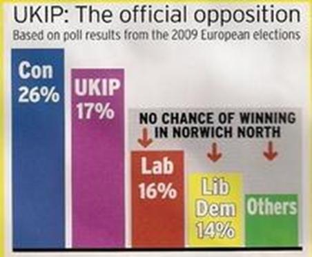
In this election leaflet, UKIP's 9% distance from the Conservative Party seems like peanuts compared to the Labour Party's 1% distance from UKIP itself.
We've seen other parties do similar things but each bar here requires its own Y axis and as a result, the bars bear absolutely no relation to the numbers they are being associated with.
Join 74,000 newsletter subscribers who trust us to check the facts
Sign up to get weekly updates on politics, immigration, health and more.
Subscribe to weekly email newsletters from Full Fact for updates on politics, immigration, health and more. Our fact checks are free to read but not to produce, so you will also get occasional emails about fundraising and other ways you can help. You can unsubscribe at any time. For more information about how we use your data see our Privacy Policy.
(Source: Electionleaflets.org)
Rule number 2: Put everything into one chart regardless
If you've got a lot to say, one chart probably isn't going to cut it. Take this example as proof. It ends up trying to say too much, and note how, "for sake of clarity" the figure for the years 1980 and 1990 have been removed from the pie chart.
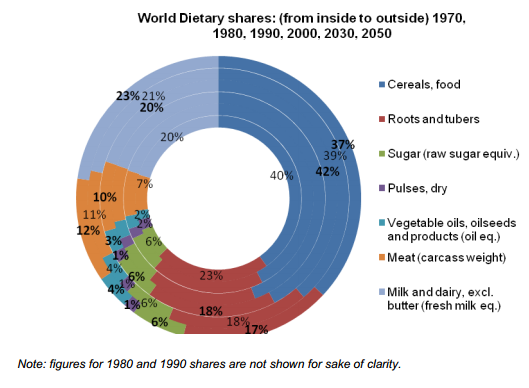
(Source: North South Parliamentary Forum Joint Working Group meeting)
Rule number 3: Don't do the maths.
Who says pie charts should add up to 100%?
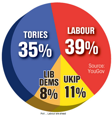
(Source: The Sun, 25 July 2013)
Rule number 4: Hide the slices in your pie chart
Lots of style; hidden substance. And while you're at it, make every slice a slightly different shade of the same colour.
Just to make things worse, this chart also complies with rule number 3.
(Source: British Future, State of the Nation)
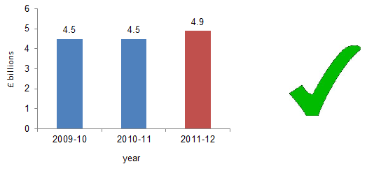
Rule number 5: Where possible, pick an axis that exaggerates changes
Here's a graph we spotted in an earlier factcheck. It purports to show the bill for redundancies in 2011-12 compared to that of 2009/10 and 2010/11.
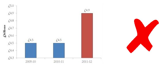
We were so appalled by this graph we came up with our own version.
Here's another offender. 1,940,000 to 2,000,000 is quite a narrow range to choose for your Y axis, and has the effect of exaggerating the trend.
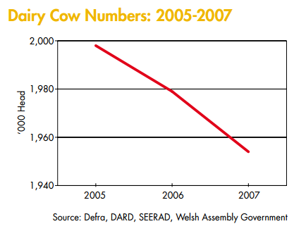
(Source: DairyCo)
Rule number 6: Clutter your pie chart
This pie chart is so cluttered that the offender ran out of colours for some countries (the UK, Iceland and Italy) and had to recycle them.
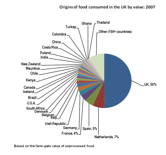
(Source: Defra)
If you have spotted a chart that you'd like to add to this list - on our site or anyone else's - email us at team@fullfact.org
----
Image courtesy of Ben Douglass