Naked graphs #9
Over the festive break, we'll be publishing highly graphic content. That's right: graphs, naked. We're very particular about labeling our graphs carefully so readers know what's going on. So for a change, we'll be featuring a graph each day with a few important features missing. See if you can work out what they're showing.
Clue: they're all based in the UK or some of its countries and cover one of our five core areas: Economy, Immigration, Health, Education and Crime.
Today is the final of the series, graph #9. Very best of luck:
Join 73,000 newsletter subscribers who trust us to check the facts
Sign up to get weekly updates on politics, immigration, health and more.
Subscribe to weekly email newsletters from Full Fact for updates on politics, immigration, health and more. Our fact checks are free to read but not to produce, so you will also get occasional emails about fundraising and other ways you can help. You can unsubscribe at any time. For more information about how we use your data see our Privacy Policy.
Comment on our Facebook page. Answer will be out on Monday.
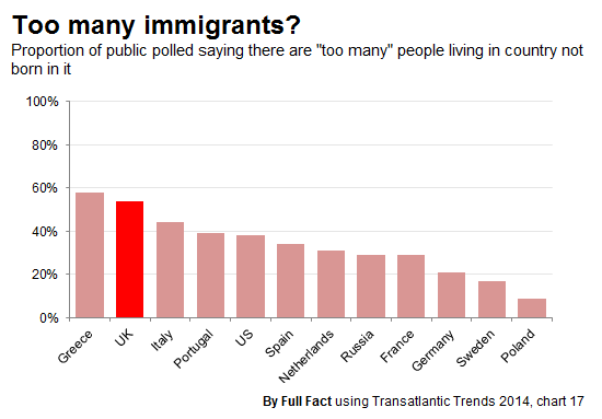
Yesterday's puzzle stumped a lot of people, lots of guesses relating to the economy. It was in fact public attitudes to immigration, measured in the annual Transatlantic Trends series. As a shameless plug, we've covered attitudes to immigration more comprehensively here.
Update (5 January 2015)
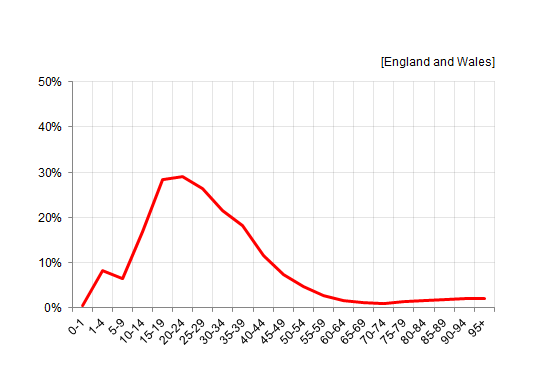
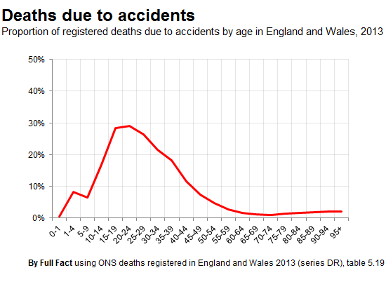
The answer to our final graph puzzle was deaths due to accidents by age group, showing young people are the most likely to die by this cause as opposed to other factors. We previously used a version of this in a factcheck from last year.
A very well done to everyone who got this and the other graphs in our series, and a happy new year from all of us at Full Fact.