Bad charts: Times has trouble with its times
The Times today carried an article on American military spending in Europe, but it was the accompanying graph showing the change in the number of US forces based in Europe that caused the bigger stir on Twitter.
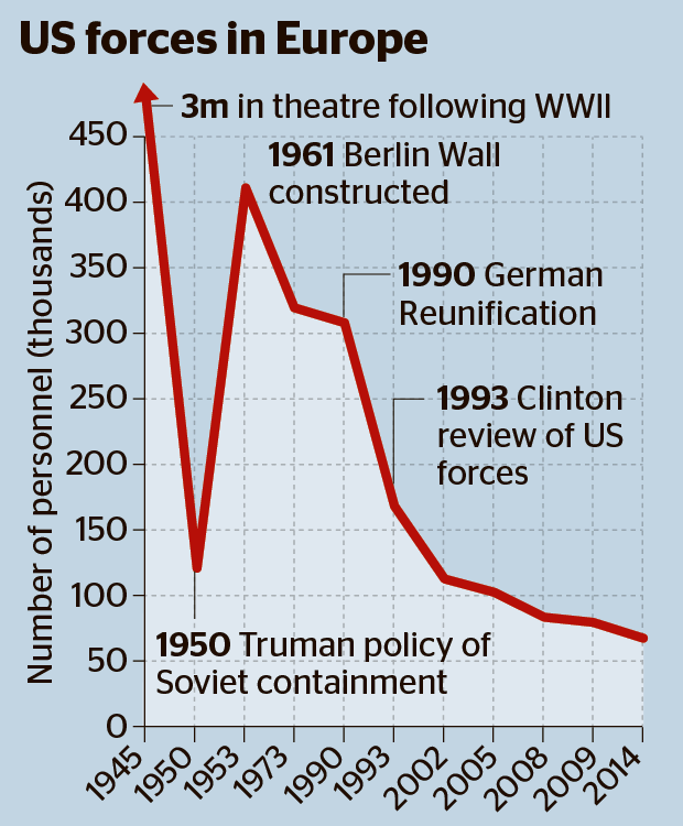
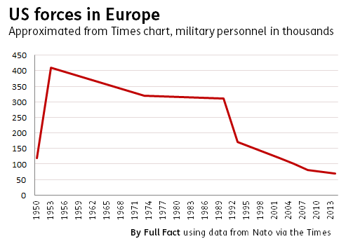
The problem, as several people pointed out, was while the first five dates on the x-axis covered a 45-year period, the last five dates covered just 12 years, giving a very strange sense of time scale.
We've noted before that presenting a truncated set of values on the y-axis can exaggerate the apparent scale of the data being presented. The same is also true for values on the x-axis.
Join 73,000 newsletter subscribers who trust us to check the facts
Sign up to get weekly updates on politics, immigration, health and more.
Subscribe to weekly email newsletters from Full Fact for updates on politics, immigration, health and more. Our fact checks are free to read but not to produce, so you will also get occasional emails about fundraising and other ways you can help. You can unsubscribe at any time. For more information about how we use your data see our Privacy Policy.
We've contacted Nato to ask for the original data source.
In the meantime, we've produced our own version of the chart by approximating the data presented in the Times's version. As you can see, the drop in US military personnel on European soil seems much more gradual once we add back in the missing dates.