Bad graphs: The government's employment record
This graph is a favourite of the Department for Work and Pensions, and routinely takes the top spot on the department's own website when employment figures come out:
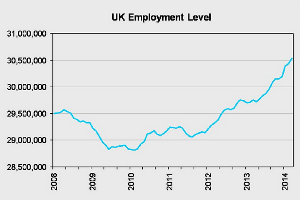
It's perfectly accurate, but accuracy on its own isn't enough to communicate the information well. It's bad at giving context; it's bad at reflecting the scale of the changes, and its not a particularly helpful measure anyway for assessing any government's record on employment compared to another.
Employment almost always rises, in part because the population's rising as well. The dip at the start of the government's graph coincides with the recent economic downturn, but before that numbers in work were growing fairly steadily. What is new is that - compared to the previous three months - employment is rising faster than it has done before, and the employment rate - the proportion of working-age people in work - is close to record levels.
Join 74,000 newsletter subscribers who trust us to check the facts
Sign up to get weekly updates on politics, immigration, health and more.
Subscribe to weekly email newsletters from Full Fact for updates on politics, immigration, health and more. Our fact checks are free to read but not to produce, so you will also get occasional emails about fundraising and other ways you can help. You can unsubscribe at any time. For more information about how we use your data see our Privacy Policy.
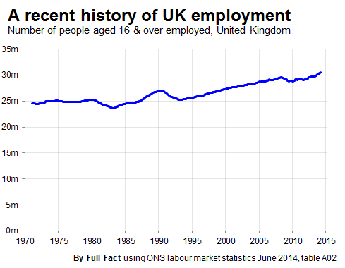
Choosing such a restricted scale isn't always wrong because detail can be useful. Here, though, it doesn't hurt to provide a little context:
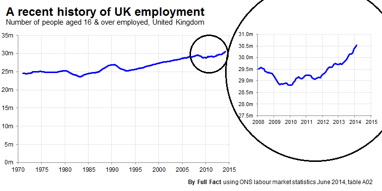
Better still, provide context and detail at the same time:
Update
All that talk about context, another tip is to get the units right. We've updated our graphs from showing 'thousands' to 'millions'.