Bad Graphs: Is this graph doing well or badly?
Take a look at the Y axis.
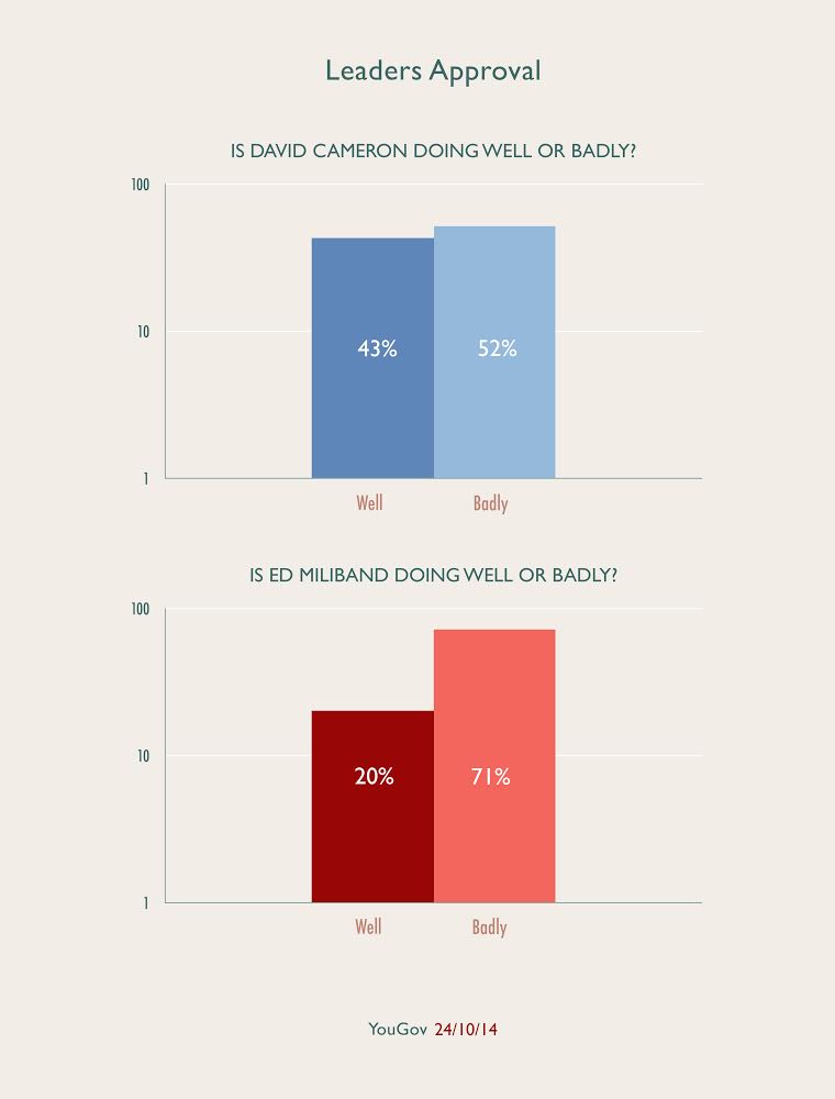
It's easy to be misled by the scale. The graph from the website May2015.com is using a logarithmic scale: the Y axis progresses 1, 10, 100, 1000 and so on rather than 1, 2, 3, 4. The distance between 1 and 10 on the Y axis is the same as the distance between 10 and 100, but the range of numbers covered in the second interval is much greater.
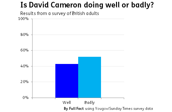
This means that the columns are compressed after they pass the first tick mark (10%). Using a standard scale, the graphs look like this:
Join 73,000 newsletter subscribers who trust us to check the facts
Sign up to get weekly updates on politics, immigration, health and more.
Subscribe to weekly email newsletters from Full Fact for updates on politics, immigration, health and more. Our fact checks are free to read but not to produce, so you will also get occasional emails about fundraising and other ways you can help. You can unsubscribe at any time. For more information about how we use your data see our Privacy Policy.
Update (31 October)
May2015 have updated the graph on their website, changing the axis to the usual scale.