What's happening to net migration?
A new Conservative campaign poster has been doing the rounds on Twitter recently:
At first glance, the point looks obvious: under the Conservatives 37,000 more people left than arrived in 2011 and 62,000 in 2012 (up to September).
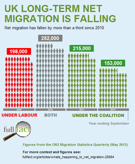
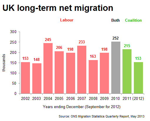
Wrong. Leaving aside the obvious point that we're governed by a Coalition, not a Conservative government, the best figures we have available from the Office for National Statistics (ONS) show that in the year ending September 2012 (the last bar on the chart), 153,000 more people entered than left the UK.
Join 73,000 newsletter subscribers who trust us to check the facts
Sign up to get weekly updates on politics, immigration, health and more.
Subscribe to weekly email newsletters from Full Fact for updates on politics, immigration, health and more. Our fact checks are free to read but not to produce, so you will also get occasional emails about fundraising and other ways you can help. You can unsubscribe at any time. For more information about how we use your data see our Privacy Policy.
What the Conservative figures show is the change in net migration (immigration minus emigration) between one year and the next. This is useful for seeing in which direction net migration is heading, but it shouldn't give the impression that the UK's population due to migration is decreasing.
So we came up with a better version:

However even this lacks some context. To get a better idea of what's going on, we should look further back in time as well:

It's perfectly reasonable to make a campaigning message out of reducing net migration, but it would be understandable if people got the wrong idea from images like the one being circulated on Twitter.
If you see claims like this circulating social media, get in touch with us via Twitter or Facebook.