Prime Minister's Questions, factchecked
Join 73,000 newsletter subscribers who trust us to check the facts
Sign up to get weekly updates on politics, immigration, health and more.
Subscribe to weekly email newsletters from Full Fact for updates on politics, immigration, health and more. Our fact checks are free to read but not to produce, so you will also get occasional emails about fundraising and other ways you can help. You can unsubscribe at any time. For more information about how we use your data see our Privacy Policy.
“...we have taken millions of people out of paying income tax altogether [and] basic rate taxpayers under this government have seen a tax cut equivalent of £1,000”
Theresa May, 19 July 2017
It’s correct that millions of people now aren’t paying income tax when they otherwise would have been, due to increases in the income tax personal allowance, which we’ve summarised before. But this doesn’t mean all those people are taking home more money, due to wider changes to taxes and benefits.
According to government estimates, around an extra four million people have not had to pay income tax since 2010/11 due to an increase in the personal allowance, which is the amount that can be earned before tax has to be paid. This is currently £11,500, an increase from £6,475 in 2010/11.
The 2016 spring budget said “a typical basic rate taxpayer will pay over £1,000 less income tax in 2017-18 than in 2010-11”. Similar claims have been made in previous years. We’ve asked the Treasury for the analysis that the latest claim is based on.
This doesn’t mean that those paying less due to income tax changes are taking home more money. The Institute for Fiscal Studies found that when including changes to other taxes and benefits such as VAT and child tax credits, changes have led to “significant reductions in household income” for low-income households between 2010 and 2015.
“Last week our National Health Service was judged the best healthcare system. Best, safest, most affordable.”
Helen Whately MP, 19 July 2017
“The NHS [is] once again —because this isn't the first time—the number one health system in the world.”
Theresa May, 19 July 2017
Is the NHS the best healthcare system in the world? It’s not an easy question to answer, and the latest research being referred to doesn’t answer it.
It’s actually not meant to. The study—done by the Commonwealth Fund, a private foundation in the US—looked at 11 rich countries and compared their healthcare systems on a number of criteria, ranking the UK in first place. The authors told us the analysis didn’t distinguish between NHS and private healthcare in the UK, or between countries within the UK (each of which has a separate system).
Studies like these also need to make a lot of judgement calls about what to consider in forming the rankings: how valuable is equal access, for example, compared to timely care? What you consider to be a good healthcare system might not be the same as what this research takes as its starting point.
None of these points mean the research itself is bad: the problems start when the ranking is passed off as the final word on how the NHS is doing compared to other countries.
Comparing rich countries
The Commonwealth Fund report covered Australia, Canada, France, Germany, the Netherlands, New Zealand, Norway, Sweden, Switzerland, the United Kingdom, and the United States.
The UK was ranked first overall, though its performance varied across the five areas. It was ranked first for ‘Care Process’ and ‘Equity’, third for ‘Access’ and ‘Administrative Efficiency’, but second-to-last for ‘Health Care Outcomes’.
The previous Commonwealth Fund report in 2014 also placed the UK first overall.
Defining UK healthcare
The study wasn’t actually focused on the NHS—which is different depending on which UK country you’re in—but on the UK healthcare system as a whole. The authors told us the surveys were weighted to take account the size of each country in the UK and so the bulk of the UK results would reflect the performance of NHS England.
80% of spending on UK healthcare in 2015 was by the government, largely on NHS services.
Patient experience matters
The five main areas were broken down and assessed using surveys of patients and doctors plus official statistics from the OECD, WHO and European Observatory on Health Systems and Policies. The existence of comparable data between countries influenced which measures were chosen, so things like mental health and long-term care services are not well covered.
The Nuffield Trust health think tank noted in response to the Fund’s previous report that:
“These results provide only a partial view of health care quality and how patients and physicians answer the questions may be affected by their own experiences and expectations; which are likely to differ across countries, cultures and population groups. For example, if the British are generally positive about their health care system and have lower expectations than say the Norwegians, the UK system will score better.”
Choosing what’s important
Each of the five main areas assessed by the Commonwealth Fund was weighted equally. So, for example, a service being affordable and timely (access) was as important as the difference in care reported by people with higher and lower incomes (equity).
A lot rests on choices like these, according to the King’s Fund and Nuffield Trust health think tanks. The King’s Fund weighed in on a previous version of this study:
“The Commonwealth Fund’s study is primarily designed to highlight poor performance in the US system. As we’re good at lots of things that the US isn’t – like access to care—we come out particularly well”
It went on to stress that this didn’t mean comparative rankings like the Commonwealth Fund’s are misleading or unhelpful—they can raise questions and highlight areas that need attention.
The Nuffield Trust, meanwhile, also commented on the latest study, saying that “While the NHS does well on a number of measures including efficiency, affordability, equity and some aspects of the process of care, it performs poorly in terms of outcomes.”
It says that because the five themes examined by the Commonwealth Fund are given equal weight, the fact the UK does well in some “swamps the effect of its disappointing outcomes on its overall score.”
It concludes “One thing is clear though: just because a ranking system produces a result we like does not mean that it is the final word.”
Other reports rank the UK lower
Different international comparisons look at different countries and measure healthcare performance in different ways.
The Euro Health Consumer Index ranked the UK 15th out of 35 European countries at the start of this year (although the authors point out that precise rankings aren’t that important). This was based on 48 measures across six areas, chosen to reflect patients’ experiences.
A 2015 study by the Nuffield Trust and Health Foundation compared the healthcare systems of 15 countries (Australia, Belgium, Canada, France, Germany, Greece, Ireland, Italy, the Netherlands, New Zealand, Portugal, Spain, Sweden, the United States and the UK). It found that for 14 out of 27 measures the UK performed worse than other countries, although it did note that the UK’s performance was “stable or improving” in 25 of the areas.
"One in eight workers in the UK, that is 3.8 million people in work, are now living in poverty. 55% of people in poverty are in working households."
Jeremy Corbyn, 19 July 2017
These figures are roughly correct, although we’ve found more recent figures showing slightly fewer workers in poverty than is being claimed.
Labour pointed us to a report from last year by the Joseph Rowntree Foundation, which used official data showing that 3.8 million workers in the UK were in relative poverty in 2014/15.
But this isn’t the latest data, so we went digging for more.
Starting from the top
There were just over 38 million working age adults in the UK, in 2015/16. Most of them were in families where at least one person is in work (‘working families’) and most of them are not in poverty.
Here’s how they break down according to the relative poverty measure (the figures differ a little on different measures). According to the estimates, nearly 29 million adults are both out of poverty and in a working family. 4 million are in a workless family but still out of poverty. Meanwhile, 3.2 million are in a working family but also in poverty. And 2.6 million are both in a workless family and in poverty.
We made a table to set that out more clearly:
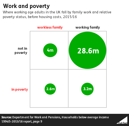
This shows, for example, that most adults in relative poverty (55%) are actually in a working family, as Jeremy Corbyn said this afternoon. At the same time, adults in working families are much less likely to be in relative poverty than those from workless families.
That 3.2 million adults in poverty from a working family rises to 4.6 million if you add in housing costs.
As we’ve looked at before, over time people in poverty are increasingly likely to be in work, although the trend has flattened in recent years.