Dashboardising BBC Question Time
This is the first post of two from Michal who joined Full Fact for two weeks in November. You can read the second one here. He analysed subtitles from BBC Question Time. This article is cross-posted on his blog.
Join 74,000 newsletter subscribers who trust us to check the facts
Sign up to get weekly updates on politics, immigration, health and more.
Subscribe to weekly email newsletters from Full Fact for updates on politics, immigration, health and more. Our fact checks are free to read but not to produce, so you will also get occasional emails about fundraising and other ways you can help. You can unsubscribe at any time. For more information about how we use your data see our Privacy Policy.
Introduction
At the end of November 2017 I had a great opportunity to work for two weeks with the Digital Team of Full Fact. Full Fact is an independent factchecking charity located in London, UK. The Digital Team of Full Fact builds tools to facilitate this mission. In the following blog post, I will write about my activities there.
BBC Question Time dashboardification
Let me start with a little bit of background.
BBC Question Time is a popular debate TV programme, featuring prominent politicians, journalists, and other influential public figures. Every show is organised around a few “big questions” asked by the audience members, selected from a local community. The panellists discuss around the posed questions. In addition, the host, David Dimbleby, asks the audience to comment on the panellists’ viewpoints. The show is broadcast every Thursday evening. The Full Fact team of Fact Checkers produces a fact checking report from every programme, which is published on Friday, right after the show. Here is an example.
Now the idea. I would like to create a visual aid (let me call it a dashboard of the show) to help with analysis of each BBC Question Time episode. It should depict the debate around each of the “big questions” brought up by the audience members.
The data
Luckily, BBC provides the subtitles for every show. This will be the fuel for the dashboard.
Moreover, the subtitles contain not only the transcript, but also styles indicating who actually spoke each line of text. There are four styles — S1, S2, S3, and S4. S1 is reserved for the host of the programme. S2 denotes audience member. S3 and S4 are used for the invited panellists (politicians, influential journalists, other public figures). There has to be at least two of them, because the panellist often comment on each others opinions. However, unfortunately, the styles do not allow for identification precisely which of the panellist should be attributed to every subtitle.
In this blog post, I will use the BBC Question Time episode from 2017.12.07 as an example.
The dashboard concept
Visualising discourse is an involved subject, see e.g. the visualisations here by Centre for Argument Technology. Nevertheless, I decided to start simple.
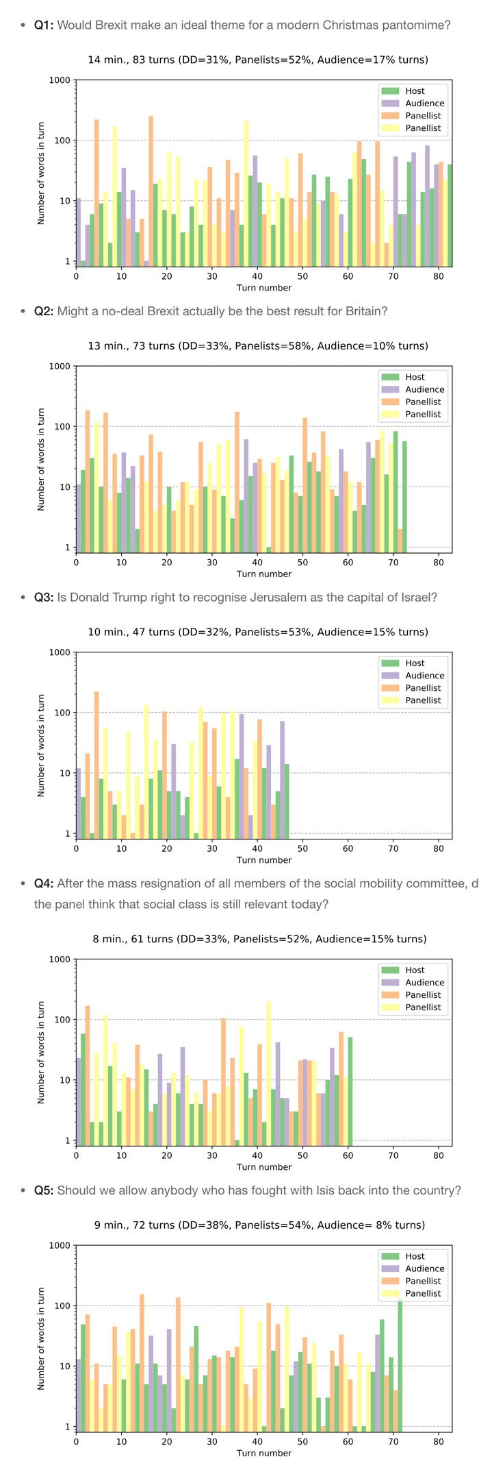
The dashboard will represent a discussion after each of the “big questions” as a bar chart.
Each bar on the chart should represent piece of text spoken by one person (I will call it a turn, for the rest of this blog post). The height of the bar will be proportional to the number of words contained in a turn. For the chart not to be dominated by a few very long remarks, I will use a logarithmic scale for number of words. I will colour bars according to who actually spoke (i.e. the host, the audience, or the panellists)
The visualisations
OK, let us see how the above idea works in practice. To make the name “dashboard” a bit more justified I added two interactive superpowers to the bar graphs. If you hoover over each bar, a tool-tip with the exact turn text should pop-up after a little delay. You can also click on each bar to play the video near that turn (opens in a new window). This is not very accurate, however.
So here are the “big questions” discussed on the show 2017.12.07 in a “dashboardised” form:
Conclusions
A closer look at the above charts reveals the following:
-
The bar charts are scaled to the question most discussed in the show. So you immediately see that Q1 had the most turns, whereas the Q4 had the fewest. Note that this is calculated in the number of turns, which does not always translate to time. However, in this case both measures agree.
-
Over each bar chart you have the statistics of turns. In all four questions the host took roughly one third of all the turns. However, notice that his points are usually very short (around 10 words). The audience also is allowed for 10–15% of turns. These are, however, longer than those of David Dimbleby.
-
The chart lets you easily locate the points with a discussion between the panellist without David Dimbleby interfering. Just look for orange-yellow stripes.
Of course the obtained graphs could be extended in many ways. For me the two ‘nice-to-haves’ are:
-
It would be great to have the turns separated in between all of the five panellists. However, this seems very difficult to handle automatically with reasonable accuracy.
-
To do visualisations one has to know what were the “big questions” discussed during the show. This seems easier to automate. I will be looking into that in the next post…
Acknowledgements
I thank the whole Full Fact Crew, especially the Digital Team and Lev Konstantinovskiy for the creative atmosphere and many hints during the project. I heartily recommend working with Full Fact, either as a volunteer or within any other opportunity at hand.