Big meaningless numbers: the viral economy infographic
We don’t care how you vote but we do care that you get the facts. Please don’t take scorecards like this at face value.
We’ve looked at the specifics but there are some general points to make first.
Join 72,547 people who trust us to check the facts
Subscribe to get weekly updates on politics, immigration, health and more.
Numbers with no context can be meaningless
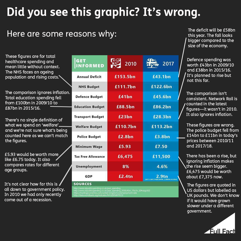
Public spending figures can be pretty meaningless without any sense of the pressures on different services. You can’t make sense of the education budget without thinking about how many more pupils are in school now than in 2010, for example. The NHS also has to look after an ageing population with increasingly expensive equipment.
However you boil it down and whatever spending areas you pick, you’re going to get a partial view of how public services are faring from figures without context.
The changes aren’t all down to one political party
The graph noticeably labels one column in red and another in blue, but there’s more to a party’s record than a single figure. Changes that happen in the economy aren’t all down to the choices that politicians make either.
Unemployment was high in 2010 partly because we’d just come out of a recession triggered by the financial crash, for example. It’s equally open to debate how much of the fall in unemployment has been down to Conservative and Coalition policies.
Likewise, you’d expect GDP to grow year-on-year in normal times—the question is whether it would have grown faster or slower if the government had done different things. There aren’t indisputable answers to these kinds of question.
There are errors and inconsistencies
As it happens, there are also plenty of errors and inconsistencies that should make you cautious about drawing conclusions. The figure for GDP is quoted in US dollars but labelled in UK pounds, for example. The minimum wage is quoted for two different age groups and not all are adjusted for inflation.
In short it’s not very helpful. If you’re not sure, don’t share.
The deficit
Claim: Was £153.5bn, now £43.1bn.
Conclusion: These are inaccurate, but might be based on old estimates. The budget deficit was £152 billion in 2009/10 (£172 billion in today’s prices) and £58 billion in 2017/18. It might be better to compare the deficit to the size of economy (GDP), and the fall is larger on this measure.
Health spending (not just the NHS budget)
Claim: NHS budget was £111.7bn, now £122.6bn.
Conclusion: The figures are right but they’re labelled wrong. That was an estimate from the King’s Fund for all health spending—including things like public health—in England, rather than the whole UK. Healthcare is also costing more with an ageing population and rising costs, and experts say more money is needed for the NHS to cope.
Defence budget
Claim: Was £41bn, now £45.6bn.
Conclusion: The older figure is about right but the newer one is wrong: it’s not clear what it’s based on. The government spent £43 billion on defence in 2009/10, in today’s money. Spending was £38bn in 2015/16. Again, the fall looks bigger if you compare it to total public spending or the size of our economy.
Education budget
Claim: Was £88.5bn, now £86.2bn.
Conclusion: In today’s money, we spent £100 billion on education in 2009/10 and we were spending £87 billion on it in 2015/16. There are also more pupils in schools now, so you’d also want to look at funding per pupil to get a sense of how far the money is going.
Transport budget
Claim: Was £23bn, now £28.3bn.
Conclusion: Again, these aren’t adjusted for inflation and it’s not a consistent comparison. Transport spending was worth about £26 billion in 2009/10 and £29 billion in 2015/16. But the definition of transport spending has changed, and Network Rail spending is now included when it wasn’t before.
Welfare budget
Claim: Was £110.7bn, now £113.2bn.
What we found: There’s no single definition of what we spend on ‘welfare’. We don’t know what’s being counted in the original table. Total social protection spending in the UK was £253 billion in 2009/10 and £274 billion in 2015/16, in today’s money. (Or £158 billion and £160 billion if you exclude pensions).
Police budget
Claim: Was £2.8 billion, now £3.8 billion.
Conclusion: These are far too small and it’s not clear what they refer to. Police spending in England and Wales would have been about £14 billion in 2010/11 in today’s money (we don’t have readily available figures for the previous year) and £11 billion in 2017/18. The fall in central government funding alone was larger. It’s been offset partly by forces raising more funds locally.
Minimum wage
Claim: Was £5.93, now £7.50.
Conclusion: Correct but not a consistent comparison: the older figure was for adults over 21 and the newer figure is for the over-25s. The current rate for those aged 21-24 is £7.05. Again, ignoring inflation makes the increase seem bigger: the old £5.93 wage would be worth £6.75 now.
Tax free allowance
Claim: Was £6,475, now £11,500
Conclusion: Correct, but similarly, ignoring inflation makes the rise seem bigger: the older allowance would be worth about £7,440 now.
Unemployment
Claim: Was 8%, now 4.6%.
Conclusion: Correct. The missing context is that the older figure came at the end of a recession in the UK, and it’s not clear how much of a role government policy has played in the fall.
GDP
Claim: Was £2.4 trillion, now 2.9 trillion.
Conclusion: The source quotes these figures in dollars, wrongly labelled as UK pounds. GDP was estimated at £1.7 trillion in 2009/10 and almost £2 trillion in 2016/17. Would it have grown faster or slower under a different government? There’s no indisputable answer to that kind of question.