Liberal Democrat manifesto 2019: fact checked
This page will feature all our fact checks on the Liberal Democrat manifesto for the 2019 general election. As with all our fact checks of party manifestos, we expect to update it on an ongoing basis as we write more about the claims made.
Join 74,000 newsletter subscribers who trust us to check the facts
Sign up to get weekly updates on politics, immigration, health and more.
Subscribe to weekly email newsletters from Full Fact for updates on politics, immigration, health and more. Our fact checks are free to read but not to produce, so you will also get occasional emails about fundraising and other ways you can help. You can unsubscribe at any time. For more information about how we use your data see our Privacy Policy.
Brexit
The Liberal Democrats claimed in their manifesto that: “Staying in the European Union will secure a £50 billion Remain Bonus, with the economy two per cent larger by 2024-25.” They then repeated this several times throughout the manifesto.
The Lib Dems’ estimate of a £50 billion increase in what the government has to spend if we remain in the EU is a fair assessment of the best available forecasts. But those forecasts themselves contain a high degree of uncertainty, so it’s too definitive to say remaining in the EU “will secure” a £50 billion bonus.
The Liberal Democrats produced estimates of how much UK GDP would grow by over five years in a Brexit deal scenario, and in a scenario where we remained in the EU. This was based largely on analysis from the independent think tank Institute for Fiscal Studies (IFS) and Citi Bank.
The Lib Dems found that, based on their calculations, GDP would be 1.9% higher in a Remain scenario than under a Brexit scenario. That works out at an additional £50 billion of extra income for the government to spend, or £10 billion each year, based on official projections of government income as a percentage of GDP.
Today Paul Johnson, Director of the IFS, said: “there is a lot of uncertainty over such an estimate… if it were to become clear not only that we were going to remain but that that was a settled state for the long term, we could expect some additional growth and with it additional tax revenue. Their estimate is within the range of plausible estimates for the extent of that additional revenue.”
The uncertainty point is important. GDP growth can be affected by a number of factors both global and domestic. The IFS told us that if, for example, a decision to remain in the EU was followed by intense political pressure to leave or have another referendum, this could create more economic uncertainty and affect GDP.
Energy
They also claimed that: “by 2030 we will generate 80 per cent of our electricity from renewables and cut energy bills and emissions by insulating homes, prioritising bringing 3.5 million households out of fuel poverty by 2025.”
The 3.5 million households in fuel poverty could refer to an estimate by National Energy Action, a charity which campaigns against fuel poverty, which is now ever-so-slightly out of date.
The latest available data shows that roughly 2.5 million households in England were in fuel poverty in 2017; 613,000 households in Scotland in 2017; 155,000 households in Wales in 2018; and an estimated 131,000 households in Northern Ireland in 2018. That gives a total of 3.43 million.
Summing up the number of households in fuel poverty is a bit complex and artificial because not all of the UK nations use the same definition of fuel poverty.
In England, a household is considered fuel poor if its required energy costs are above the national average, and paying that amount would push their remaining income below the official poverty line. In Scotland, Wales and Northern Ireland, a household is fuel poor if they would need to spend more than 10% of their income on fuel costs in order to satisfactorily heat their home.
It’s worth noting that the government has proposed changing the definition of fuel poverty in England to factor in energy efficiency which would push the number of households in fuel poverty up by another 1.1 million.
Environment
They also claimed: “This in turn has made air pollution – mostly caused by cars – one of the biggest causes of preventable illness in the UK, causing at least 40,000 premature deaths a year.”
The claim that there are 40,000 premature deaths a year originates from a 2016 report from the Royal College of Physicians and the Royal College of Paediatrics and Child Health. The report looks at the number of attributable deaths from the amount of particulate matter (very small solid and liquid material between the size of a virus and the thickness of a human hair) in the air and the number of deaths attributable to nitrogen dioxide (a toxic gas which comes from petrol or diesel car engines or natural gas in a domestic central heating boiler or power station) in the air.
However, these numbers should be viewed with some amount of caution. It is not the case that these are all individuals who have pollution on their death certificate as their cause of death. Air pollution generally makes existing illnesses worse rather than directly killing people. This number is based on an estimate which is derived from large scale studies with large margins of error.
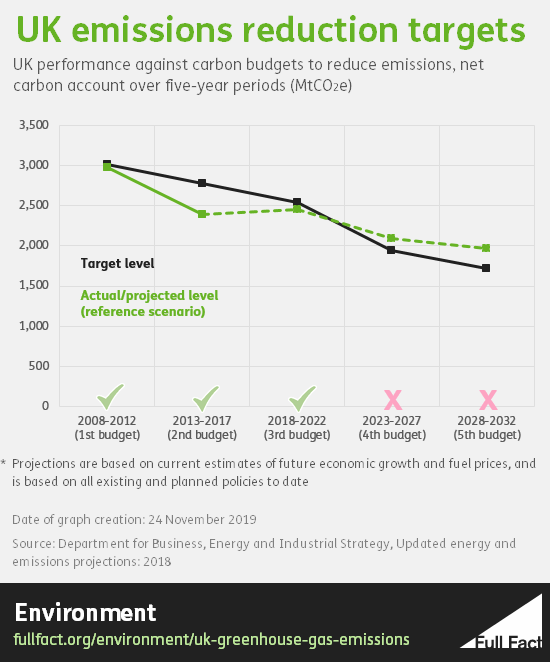
The Lib Dems also claimed the government “are not on track to meet the UK’s climate targets”. This is right—as we’ve written before, at the current rate the UK is expected to miss its emissions reductions targets for the 2023-2027 period and for 2028-2032.
That said, the government has at least made fast progress on cutting emissions in recent years and had met its targets so far.
Housing
The Lib Dem manifesto also said “rough sleeping has been increasing since the 2008 recession”.
Since 2010, the number of people sleeping rough comes from a snapshot taken in autumn each year. Councils count or estimate the number of people sleeping rough in their area, with most making an estimate after talking to local agencies.
The number of people sleeping rough has generally been increasing, from 1,768 in 2010, to 4,677 in 2018. That’s an increase of 165%. It did decrease slightly between 2017 and 2018, by about 2%. These estimates almost certainly undercount the number of rough sleepers, but it’s reasonable to accept that the number is going up.
The way the government measures rough sleeping in England changed in 2010, so we can’t make any reasonable comparison between years either side of that.
Crime
The manifesto also claims “knife crime has increased by over 75% since 2015”. It’s true that recorded knife crime in England and Wales has risen by just over 75% between 2014/15 and 2018/19, but not all of this increase will genuinely reflect increases in knife crimes happening.
As the ONS says: “A rise or fall in police recorded crime does not necessarily mean the actual level of crime in society has changed. The data can be affected by changes in recording practices, policing activity and victims’ willingness to report crime.”
But it’s also correct that the number of hospital admissions in England for assaults by a sharp object have been rising consistently since 2014/15: from 3,643 then to 5,149 in 2018/19. That’s still below the levels reached in the mid 2000s. These figures are more reliable, although they will only reflect knife crimes which have been serious enough to result in an admission to hospital.
The Lib Dems go on to claim “homicides are at their highest rate for a decade”. This is correct: in 2017/18 there were 12.4 recorded homicides per million people in England and Wales. That’s the highest since 2007/08 when it was 13.4. These figures refer to the year those homicides were recorded rather than when they happened, and they can be affected by single incidents with large numbers of deaths. Homicides in 2017/18 included 31 victims of the terrorist attacks in Manchester and Westminster that year, for instance, although the rate remains the highest for a decade without those included.
The party also says that there are “more places in the country where people simply don’t see police officers”. This is correct.
47% of adults report they have “never” seen a police patrol on foot, according to the Crime Survey for England and Wales in 2018/19. This is by some margin the highest rate since figures going back to 2006.
Health
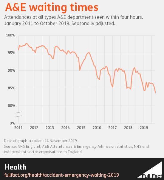
They also claimed: “the average wait for patients for a routine GP appointment is now more than two weeks and waiting times are rising in A&E and for operations.”
We’ve checked this claim about waiting times being an average of two weeks before—it’s not a reliable figure. It’s based on a UK survey from a magazine for GPs, called Pulse, and is about non-urgent GP appointments. Its findings can’t really tell us how long patients wait for GP appointments as we have no idea if the practices that responded are representative.
The magazine has been running the same kind of survey for several years, and has found an upward trend.
A&E waiting times in England are at their worst level since records began in 2010. In October 2019, 83.6% of patients attending all types of A&E department in England were admitted, transferred or discharged within four hours.
It’s not entirely clear what data they’re referring to when they say waiting times are rising for operations.
It could be referring to something known as the "waiting list", which measures referrals for treatment where the treatment has not yet begun. As of September 2019, there were 4.4 million people on this specific waiting list. This won’t just be for operations though, a number of other kinds of treatment will be involved too.
There are specific figures for operations which have been cancelled. The rate of non-urgent operations cancelled for non-clinical reasons has generally been steady since 2009/10. But the breach rate (when last minute elective operations are cancelled for non-clinical reasons and the number who aren’t treated within 28 days of a last minute elective cancellation) has generally been increasing since then.