29 November 2019, 2.12pm (updated)
Fact checking Boris Johnson on LBC
This morning Conservative party leader Boris Johnson took part in an audience phone-in with Nick Ferrari on LBC Radio. Full Fact was at LBC’s offices to fact check the claims the Prime Minister made. (LBC has also invited Labour leader Jeremy Corbyn and Liberal Democrat leader Jo Swinson to do similar phone-ins, and we will fact check them as well.)
Mr Johnson was asked about a number of topics from the NHS and social care, to police numbers and education funding.
He was unable to provide a figure for the number of post-Brexit trade deals which have been concluded—there have been 18 ‘continuity deals’ with 48 countries, but while we’ve held preliminary discussions with some countries we can’t yet formally negotiate on ‘new’ deals. And when asked about the number of buildings which have had Grenfell-style aluminium cladding removed from them he was unable to give a figure—118 buildings have so far had work completed, with a further 318 identified as in need of work.
He also seemed to extend a Conservative manifesto promise on tax, transforming it from a commitment to not increase the rate of income tax, national insurance and VAT, to a pledge not to increase these taxes at all. That’s something quite different.
You can read our full fact check of all Mr Johnson’s claims here.
Honesty in public debate matters
You can help us take action – and get our regular free email
Tree-mendous?
A Labour policy regarding the planting of more trees has ruffled a few leaves this morning.
Labour announced its “plan for nature” on Thursday morning, which included a pledge to plant two billion new trees by 2040. The Conservatives and Lib Dems proposed similar plans, but with fewer trees.
As some have worked out, hitting this target would mean planting around 300,000 trees a day. This plan has received some criticism for the size of the proposed figure and the question of where space would be for these trees.
The task of planting hundreds of thousands of trees a day isn’t an impossible idea; the BBC once lead an initiative which planted an estimated 230,000 trees in an hour in 2009, using mainly volunteers. In Turkey, over 300,000 were planted in an hour in 2019.
It’s also debatable whether there would be enough space in England and Wales for the proposed billions of trees. Between 88% and 99.9% of the UK isn’t “developed”, but this doesn’t necessarily mean this is free land—we are unaware right now exactly where Labour would want to plant their new trees.
The plan would also be affected by what type of trees are planted, as, quite simply, some trees are bigger than others. As a *very* rough estimate, Labour’s plan would cover around 5% of current UK land.
In May the Committee on Climate Change published a report setting out that around 30,000 hectares of woodland need to be added to the UK in each of the next thirty years in order to reach net-zero carbon emissions by 2050. The Woodland Trust says that’s the equivalent of 1.5 billion trees by 2050. So Labour would need to plant at about twice that rate, to hit their target of 2 billion by 2040.
For scale, in 2018-2019, thirteen thousand hectares of new woodland were created in the UK. The Woodland Trust says a target of 32,000 hectares a year is “not an insurmountable challenge… but policy enablement and incentivisation are key and are in the hands of Government”
Lowering the bar
One of the big themes of this election campaign has been, somewhat surprisingly, bar charts. As a group of people who have been banging on about bad bar charts for a long time this has been pleasing to us, albeit in a bittersweet way, like when an obscure band you’ve loved for years suddenly gets used in a beer commercial.
Anyway here are two more bad bar charts we’ve seen.
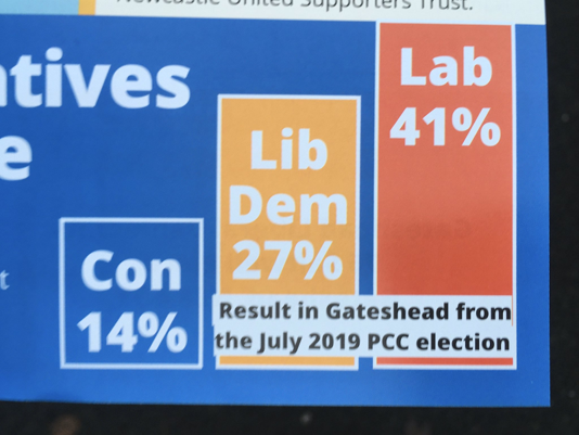
The Gateshead Liberal Democrats have taken an innovative, but highly misleading, approach to trying to show that “it’s a 2 horse race” in Gateshead between Labour and the Lib Dems.
They’ve decided to use the results from the area’s recent Police and Crime Commissioner election, showing Labour on 41%, the Lib Dems on 27% and the Conservatives on 14%.
But using an election where less than 15% of the electorate turned out to vote is... not a very helpful way to gauge how people might vote in a general election. Turnout in Gateshead at the last general election was 65%. The role of police and crime commissioner is also quite different to that of MP: being responsible for policing in an area.
And on top of this, the graph is incomplete. As you might be able to tell from the percentages on view, there’s a missing candidate - an independent received 17.9% of the vote.
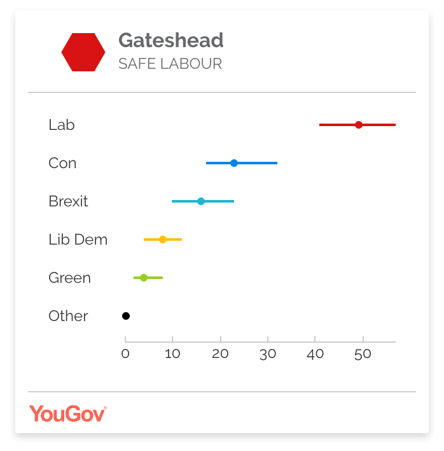
The YouGov MRP model released yesterday currently has the Lib Dems coming fourth in Gateshead, on 8%, behind Labour, the Conservatives and the Brexit Party.
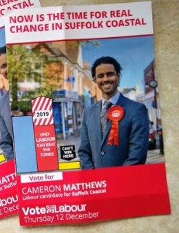
It contains a non-annotated bar chart, which presumably is meant to show the results of the last general election vote in the constituency in 2017. It shows Labour receiving roughly 80% of the Conservatives’ vote share, and the Lib Dems receiving about 10%, with the message being “only Labour can beat the Tories”.
In reality, Labour was much further behind the Conservatives than chart suggests. It received 30.5% of the vote compared to the Conservatives’ 58.1%, and the Lib Dems’ 7%. That means Labour received just over 50% of the Conservative vote share—not 80%.
The thing that makes this stand out, though, is that Labour’s bar chart has also added an exciting new feature: a candy striped arrow on top of their vote share, labelled “2019”, which puts Labour above the Conservatives.
This is presumably meant to indicate Labour’s ambition of winning the seat in 2019. It’s not strictly misleading to do this, but it’s something we (and, we imagine, most voters) haven’t seen before. As a result it makes a confused chart even more confusing.
For the record, YouGov currently thinks Labour will lose Suffolk Coastal by roughly the same margin as last time.
Wide of the Markievicz
Health Secretary Matt Hancock got some basic history wrong this morning:
Nancy Astor was not the first female MP; she was the first woman to take her seat in Parliament.
The actual first woman to be elected as an MP was Constance Markievicz, an Irish Republican (and socialist, suffragette and revolutionary) who was elected as a Sinn Féin MP for the seat of Dublin St Patrick's in December 1918, just under a year before Astor won her seat. (This was before Ireland gained independence from the UK, which was kind of the point of Markievicz’s candidacy in the first place.)
As is still the case with Sinn Féin MPs, Markievicz did not take her seat in the Commons; she did not recognise the legitimacy of the Westminster parliament and refused to take the oath. Also, she was in jail in Holloway Prison at the time. But she was still the first female MP.
Nancy Astor was elected for the Conservatives to the constituency of Plymouth Sutton in a by-election in November 1919–the seat had become available after her husband, the previously sitting MP, inherited his father’s peerage.
You can read more about all the women who have ever been elected as MPs here.
Our take on the SNP's manifesto
Good afternoon! We spent yesterday looking through and checking the SNP's manifesto, we wrote about our findings here.
Notably, we found there was an error in their figures for international exports:
The manifesto said: “Scotland’s international exports are stronger than ever. Since 2011, our international exports, excluding oil and gas, have increased by over 57% and are now worth £32.4 billion. Of this, almost half were exports to the EU.”
The SNP told us (after this article was first published) that this was an error in the manifesto and the change was since 2007, rather than 2011. International exports since 2011 have in fact risen by 19%, not 57%.
We are waiting to see if this is updated in their manifesto.
We’ve checked all of the major party manifestos, and if you want to take a look at any of our checks, or general election content, you can find that here.
Labour isn’t ditching the single occupancy council tax discount
We’ve seen this claim across social media today: that Labour would get rid of the 25% single occupancy discount on council tax. These claims have been shared well over 20,000 times on both Twitter and Facebook.
This is not Labour policy.
It seems to stem from some confusion over a Labour-commissioned report from earlier this year, which did say that the single occupancy discount encouraged inefficient use of housing stock. But a policy to scrap it isn’t in the manifesto or costings document.
You can read our full piece here.
Councils aren’t using postal ballots to suppress the youth vote
We’ve seen a few posts going round social media today claiming that the date of birth section on postal ballots is being pre-filled with the year starting “19” like this.
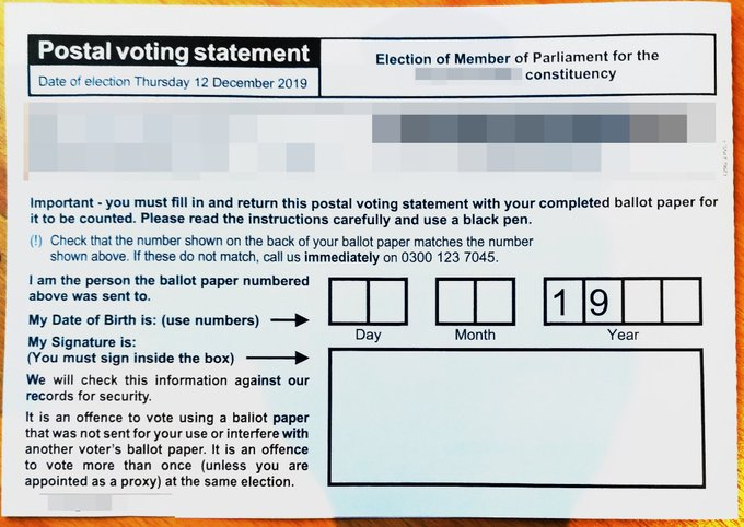
We don’t think there’s anything to be worried about here. We contacted Bromley council who said that they do pre-fill the date of birth on postal ballots, but that voters born in 2000 or 2001 would receive a ballot prefilled accordingly with “20..”
That was also the response of Cheshire West and Chester Council, the source of another of the questioned ballots.
Postal ballots are pre-filled like this to discourage people writing in the current date, rather than their date of birth.
Bromley Council told us that the chance of someone receiving an erroneously pre-filled ballot was very small, but that if anyone born in the 2000s does, they should just cross the “19” out and write their actual year of birth above.
Honesty in public debate matters
You can help us take action – and get our regular free email
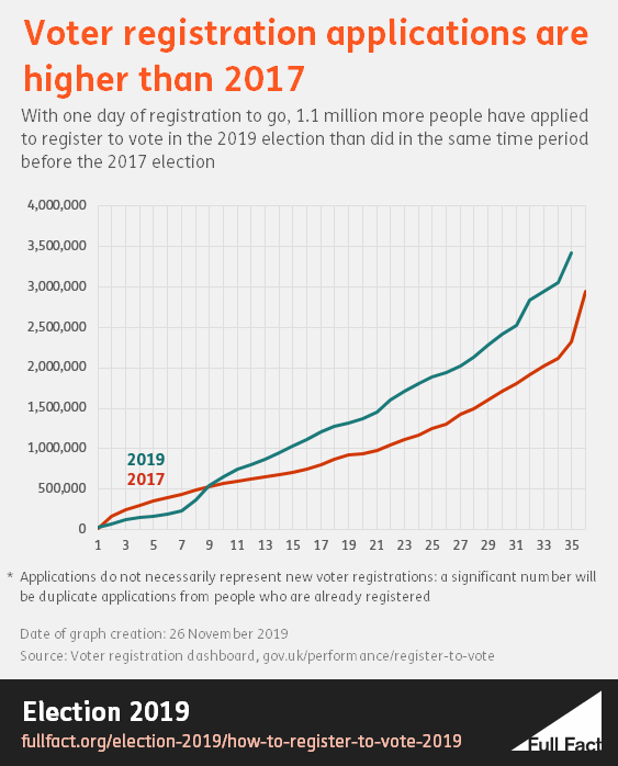
On an (electoral) roll
Did you know that today is the last day you can register to vote in the election on December 12? Well, it is. You've got until 5pm to register for a postal vote (unless you're in Northern Ireland, in which case it's too late), and until 11.59pm to register to vote in person (that includes in NI).
We've written a helpful guide to everything you need to know about registering to vote.
This election campaign has seen significantly higher applications for voter registration than in the same time period before the 2017 general election.
But it's worth noting that this doesn’t mean they are all new voters. Based on previous votes, a significant number will be duplicate applications from people who were, in fact, already registered to vote.
BBC deletes inaccurate child poverty claim
The BBC reported this morning on analysis predicting that child poverty is expected to rise under the Conservatives’ plans for government.
The Resolution Foundation think tank estimated that, because the party's manifesto does not propose changes to benefits, relative child poverty could reach 34% by 2023/24.
The BBC included a response from the Conservatives challenging the report which they reported as: “The Tories said 750,000 fewer children are in poverty since they took power.”
This claim is incorrect. No measure of child poverty shows a fall of 750,000 since 2010—most of the main measures show a rise. The measures that do show a fall put it at about 100,000, well short of the amount claimed.
The line was on the BBC website for most of this morning, but in the past hour the BBC has removed the claim from its article. At time of writing, the claim is still in the BBC’s morning news roundup.
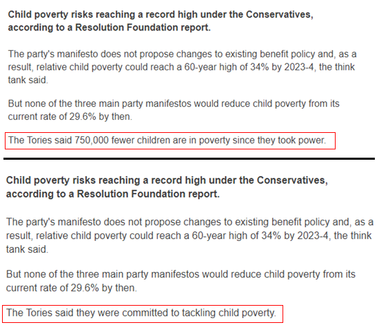
It’s possible the BBC misquoted a Conservative quote to the Guardian, which the BBC actually quotes in full later on in its article. The Conservatives said that “We are committed to tackling child poverty and have made progress since we came into government – with 730,000 fewer children in workless households.”
The 730,000 figure is correct and shows the change in the estimated number of children in workless households between April to June 2010 and 2019. But it’s not a measure of poverty.
We’ve asked the BBC to confirm if the figure was misquoted, or if the Conservatives actually sent them the inaccurate claim.
NHS funding boost not at record levels
The Prime Minister has repeatedly made claims that the NHS is set to receive £34 billion and described this in a number of ways: as the biggest spending increase in modern memory, or a “record sum” or the biggest boost for a generation.
It’s certainly not a record sum and whether or not you think this is the biggest increase in modern memory really depends on how good your memory is.
The £34 billion is a spending increase in real terms of £20.5 billion between 2018/19 and 2023/24 (this was first announced in July 2018). The last time spending increased by at least that amount in real terms was between 2004/05 and 2009/10, when it increased by £24 billion in real terms.
We've written more about this here.