What was claimed
The rise in deaths is the largest for almost fifty years, prompting concerns about a crisis in elderly care.
Our verdict
Provisional data suggests the increase in deaths in England and Wales from 2014 to 2015 was the largest annual rise since 1968. The rate of death—the number of deaths per 1,000 population—is also thought to be up. The ONS told us the higher number of deaths was due to the flu.
“Biggest annual rise in deaths for almost fifty years prompts warnings of crisis in elderly care”
The Telegraph, 16 February 2016
A similar story was reported in the Times. Provisional data suggests that the increase in deaths from 2014 to 2015 was the largest annual rise since 1968. There were thought to be around 528,000 deaths last year in England and Wales, an increase of 5% from the 501,000 deaths in 2014.
The rate of death—the number of deaths per 1,000 population—is also thought to be up. This doesn’t account for changes in the age profile of the population—you’d expect more deaths in a population that’s getting older.
The Office for National Statistics told us that the flu is behind the higher number of deaths in 2015. Over the longer term mortality rates have been falling.
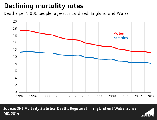
Longer-term decline in mortality
The figures for the numbers of deaths come from official provisional data, though in the past few years the final figures haven’t been very different. For example, the monthly provisional data for 2014 suggested there were 500,122 deaths in England and Wales, while the final data reported there were 501,424 deaths.
So the actual rise in deaths from 2014 to 2015 may be a little higher when the revised figures for 2015 are released.
Over the longer-term, the number of people dying each year has been falling.
It’s also important to look at the rate of mortality, which accounts for the size of the population. These figures haven’t been released for 2015 yet, but the Health Service Journal (HSJ) put together estimates for 2015 using separate population projections.
This suggests that there were around 9.1 deaths for every 1,000 people in 2015, an increase of 5% from the rate of 8.7 for every 1,000 in 2014.
But this still doesn’t account for how the numbers in each different age group and the numbers of each gender have changed. For example, if a larger number of older people have returned to England from other countries in one year.
We need to use the “age-standardised” mortality rates to find this out. They haven’t been published for 2015 yet, but the trend over the longer-term has shown a decline in the mortality rate.
Public Health England
said last week that life expectancy at older ages in England had risen to its highest level on record in 2014.
There are localised factors at play here. It said that life expectancy varies quite a lot depending on where you live.
Flu accounted for the higher number of deaths
The Telegraph said the rise could be due to a “crisis in care of the elderly”, citing experts who referred to cuts to social services.
According to official statisticians, the reason for the rise was people catching the flu, which led to a higher number of deaths in the first three months of 2015. There could be multiple reasons for this.
Deaths among the elderly can show more short-term variation than deaths for younger people, due to factors such as extreme weather and bouts of flu, according to Public Health England.
Update 17 February 2016
We added 'in 2014' to make it clear that Public Health England's life expectancy analysis also only goes up to 2014.