Are real wages rising or falling? Sometimes it can be either
This graph shows how next time you read about rises or falls in 'real wages', you'd be well justified in asking "by whose measure?"
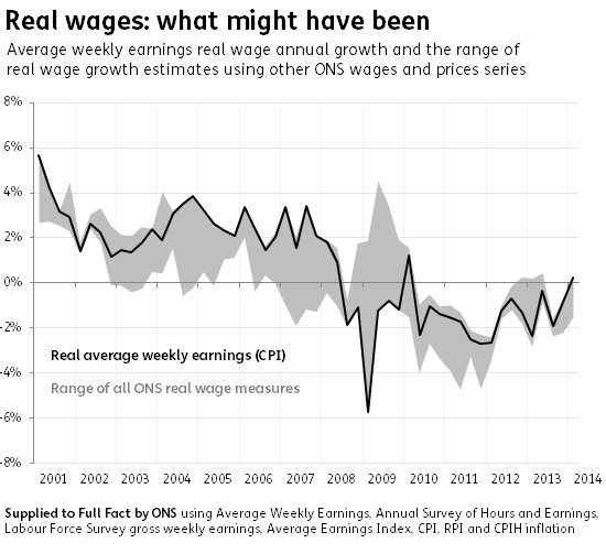
Taking average weekly earnings estimates from the ONS and comparing them to Consumer Price inflation (CPI) - as the black line on the graph highlights - is the most common metric people tend to quote. However the Labour Party has been among those to reference other measures when discussing changes to real wages.
Change the measure of wages or inflation, however, and you could end up anywhere in the grey area, leading to potentially very different conclusions about how people's pay packets are faring.
Join 74,000 newsletter subscribers who trust us to check the facts
Sign up to get weekly updates on politics, immigration, health and more.
Subscribe to weekly email newsletters from Full Fact for updates on politics, immigration, health and more. Our fact checks are free to read but not to produce, so you will also get occasional emails about fundraising and other ways you can help. You can unsubscribe at any time. For more information about how we use your data see our Privacy Policy.
At one point in 2009, for instance, you could have quoted figures suggesting real wages were either growing by 2% or shrinking by 6%. The ONS explains this is connected to the volatility of the economic downturn.
On the wages side: bonuses plummeted and then surged while regular pay changed relatively little, so including or excluding bonuses makes a big difference. On the prices side: the Retail Prices Index - which includes housing costs - became negative and so where people's pay packets stayed constant they would effectively have risen in real terms counting by RPI. Not so if real wages were measured by CPI.
We've suggested that the ONS makes this data on measure comparison a regular item rather than a one-off, so that it's easier for people to see the grey areas that surround these common and important claims.