How to spot misleading poll figures
You’re browsing Twitter or Facebook and see the claim: “Two-thirds of the public - including a majority of Leave voters - now think the outcome of Brexit negotiations will be bad for Britain.”
If you’re not yet bored of Brexit news, you may find yourself wondering whether you can believe that figure, and what it actually means. But how can you tell whether figures from a poll are trustworthy or meaningful?
Polls often dominate political conversation and many national newspapers have an ongoing relationship with their pollster of choice to generate eye-catching statistics for their front pages.
It can sometimes be difficult to sort the wheat from the chaff, but here are a few steps you can follow to help you judge how trustworthy a poll is.
Join 74,000 newsletter subscribers who trust us to check the facts
Sign up to get weekly updates on politics, immigration, health and more.
Subscribe to weekly email newsletters from Full Fact for updates on politics, immigration, health and more. Our fact checks are free to read but not to produce, so you will also get occasional emails about fundraising and other ways you can help. You can unsubscribe at any time. For more information about how we use your data see our Privacy Policy.
Find the source
The first step is to find the source of the claim – the data.
Often polls you will come across in the news are commissioned by newspapers or broadcasters, and they will make it clear who did the poll. They probably won’t go into much detail about how the survey was done, but if you go to the pollster’s website you should find more information.
For example, this graphic went viral a few weeks ago, and it sources the data to a YouGov poll:
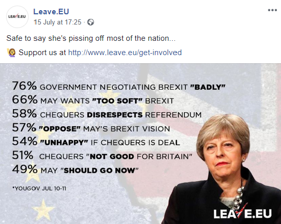
YouGov have an area on their site with raw data from which you can access more information and full data tables on the poll.
If the claim doesn’t make clear where the polling data comes from, that might be a red flag – but if you’re in doubt, try using a search engine for any of the individual figures to find the pollster.
Take this claim:
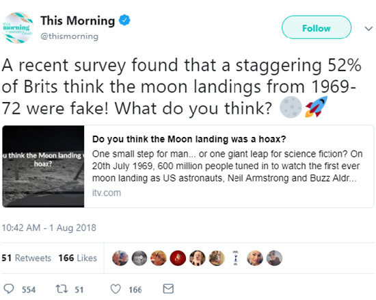
Neither the tweet not the post it links to gives any detail on who conducted this poll. But a simple search for “brits 52% moon landings fake” brings up various press articles that reveal it was conducted by a marketing firm on behalf of a mobile phone company. And searching the website of the marketing firm shows no evidence of them publishing the data.
The British Polling Council set standards for associate members that help guarantee that reputable pollsters publish their data, as well as details on the methods they used, and who commissioned the research. If the pollster doesn’t publish the data and an explanation of the way the survey was done (which they should do soon after the poll results are made public), then there’s no good reason for you to trust their results.
(For the record, YouGov polls in 2012 and 2015 gave the much lower figures of 12% and 9% of Brits being sceptical of the moon landings.)
Look at who have they surveyed
A survey, by design, asks a small group of people (the “sample”) what they think, and tries to make sure that those people represent the wider population . Which means a survey is only as good as the people it surveys.
Pollsters do this in two ways. Firstly they try and survey a group of people that look like the population. For example, they may try and survey men and women in equal proportion if they’re doing a survey about the general public’s views on a topic.
Secondly, to make up for the fact that it’s basically impossible to get a perfectly representative sample, pollsters will “weight” their sample – adjusting the raw numbers so that they match known characteristics of the national population, such as the ratio of men and women. Different pollsters do this in different ways: they might look at how people voted in previous elections or referendums, measures of social class, or their level of education.
You can usually find this information at the top of the data tables, after the word “base”. Here’s a recent example from Sky:
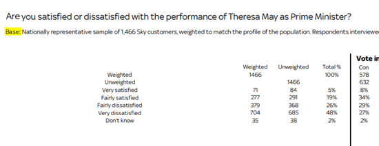
Surveying different groups can affect the data in different ways. For example, we factchecked one poll on Brexit which didn’t survey Northern Irish respondents . That’s the case with a lot of political polling in the UK, largely because Northern Ireland’s party system is different from the rest of the nation. But on an issue like Brexit, which is of particular relevance to Northern Ireland, it’s worth noting who is included and who isn’t when you interpret the poll’s meaning.
The poll above by Sky only surveys Sky customers, who may not be representative of the UK population. Surveys carried out online don’t capture the views of non-internet users; phone surveys that only call landlines will miss people who only have mobiles.
There’s no perfect survey method, and these aren’t reasons to discount the poll by themselves.
But being clear about who the data represents and how it was weighted are essential parts of good polling. Even if the survey doesn’t perfectly represent the whole of the UK, it doesn’t mean you can dismiss the findings. But it’s important to understand the data’s limits if the sample is something different. It’ll help you answer the question “Who does this data really speak for?”.
Size matters, sometimes
It’s also important to check the size of the survey. Bigger is not always better – it’s more important that the pollster has selected their sample carefully and made sure it represents the people it’s claimed to be about.
But if you’ve checked the sample and are confident that it’s been well selected and weighted, bigger is usually better. It means there’s a lower margin of error associated with the results. As a rule of thumb, national polls that survey significantly fewer than 1,000 people will have relatively large margins of error. (But there’s also diminishing returns with increasing sample size – a survey of 2,000 will have a much lower margin of error than a survey of 1,000 – but a survey of 20,000 will have a similar margin of error to a survey of 10,000.)
Finally, pay attention to whether a particular claim is discussing everybody in the survey, or just a subsection of the people sampled. A poll of 1,500 people is a good sample size, but claims about smaller groups within that sample (say, “UKIP voters” or “people under the age of 24”) will be based on much smaller numbers of people, and so again will have much larger margins of error.
What have they asked?
Once you’re happy that the pollster has surveyed a representative, large-enough group of people, the next thing is to check what they actually asked.
Survey questions should not lead the respondent to a particular answer. There are many ways this happens but some common problems are:
- Acquiescence bias: If you ask someone whether they agree with something, they’re more likely to say “yes” than “no”. This is called acquiescence bias. Good survey questions use wording like “do you agree or disagree” to avoid this.
- “Loaded” questions: Questions shouldn’t include value statements. If you ask “Following Theresa May’s dreadful performance this week, do you agree or disagree she should stay as Prime Minister” you’re leading the respondent to a certain answer, and that will skew the results.
- Question order: Depending what kind of questions you ask, and what order you ask them in, people’s responses to questions can vary quite a lot (as this clip from the classic sitcom Yes Prime Minister explains quite well). So don’t just look at a single question; look at it in the context of the other questions asked.
- Social desirability bias: Most people are like Mr and Mrs Dursley: they would be proud to say that they were perfectly normal, thank you very much. And sometimes they’ll lie to a faceless survey to prove it. If you ask people how often they shower or how much they drink, they’re likely to adjust their answers to something more socially desirable. Take this data with a pinch of salt. Put yourself in the respondent’s shoes. Would you answer this question truthfully and how has the survey tried to ensure you would?
- Compound questioning: If a question asks “Do you agree that Theresa May is managing Brexit negotiations well and should stay as Prime Minister”, the respondent is asked to essentially give one answer to two questions – is Theresa May managing the negotiations well AND should she stay as Prime Minister. Data that comes from questions like this can’t always be trusted to give accurate data about either claim because the results are muddied. We’ve written more about this here.
This isn’t an exhaustive list but covers the main pitfalls of question design . If a claim comes from a question that might be “loaded”, consider how that could have skewed the result.
Does the data match the claim?
On the whole, pollsters usually put out decent questions, get back fairly reliable data and are transparent with their method.
But when pollsters’ data gets into the public domain, the findings can be shifted and warped to the point where the claim doesn’t match the findings any more.
For example, take this claim about peoples’ preferred Prime Minister:
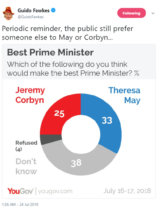
The claim says that the public would prefer someone else to Theresa May or Jeremy Corbyn. But that’s not what the data says at all. The data says that when asked who would make the better Prime Minister out of the two, 38% answered “don’t know”.
And with those claims about the public’s views of the Brexit Chequers deal we looked at earlier…they only covered the views of Leave voters, not the public as a whole.
Finally, make sure you understand exactly what’s being said. Take the claim we started with: “Two-thirds of the public - including a majority of Leave voters - now think the outcome of Brexit negotiations will be bad for Britain.”
That’s an accurate description of one of the poll’s results, but it would be easy to over-interpret its meaning – for example, thinking it suggests a majority of Leave voters now oppose Brexit.
But the question is specifically about the negotiations with the EU. The survey actually asked a separate question “Do you think Brexit is a good or bad thing for the country overall?” to which only 11% of Leave voters said it would be a bad thing.
Often polls ask lots of very similar nuanced questions like this that get different results. So make sure to look carefully at what’s been asked, and look at the other questions in the survey to get a more rounded view on what people think about a topic.
It’s not black or white
Ultimately, judging claims that come from surveys is rarely straightforward. It’s often a case of judging the level of quality. No poll is perfect, and it’s rare that a poll is completely useless.
But running through these common limitations will help you judge the extent to which you can trust a poll’s results.