Factchecking the Summer Budget 2015
"I am today introducing a new National Living Wage"—George Osborne
The new National Living Wage is essentially an additional band, on top of the existing minimum wage.
The current minimum wage has different rates for different age groups. The Living Wage Premium for workers aged 25 and over would sit on top of the current rate for workers aged 21 and over.
The new living wage is scheduled to be introduced in April 2016 at £7.20 an hour. That's 50p higher than the minimum wage will be at that point.
The government's target is for the National Living Wage to climb to 60% of median earnings by 2020.
Join 74,000 newsletter subscribers who trust us to check the facts
Sign up to get weekly updates on politics, immigration, health and more.
Subscribe to weekly email newsletters from Full Fact for updates on politics, immigration, health and more. Our fact checks are free to read but not to produce, so you will also get occasional emails about fundraising and other ways you can help. You can unsubscribe at any time. For more information about how we use your data see our Privacy Policy.
On current forecasts, 60% of the median wage would mean a National Living Wage of over £9 an hour for the over 25s in 2020.
But the Chancellor's living wage is not designed to be equal to the living wage set out by the Living Wage Foundation.
The Living Wage Foundation's figure is based on asking people what they consider to be a minimum standard of living.
60% of the median income isn't always going to equal that figure.
"We in the UK produce on average 30 per cent less per hour than workers in Germany, France and the US."—Harriet Harman
The figure of 30% refers to how much more other countries produce (the UK produces about 22% less on average). In 2013 an hour's work in Germany produced 28% more output than an hour's work in the UK. In the US it was 31% more and in France it was 27% more.
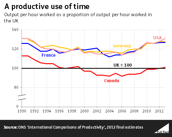
As we've found previously, the gaps with Germany and the US are the widest they've been since 1991, while the gap with France is the widest it's been since the data begins in 1990.
"This year, that national debt share is falling. Bringing to an end the longest continued rise in our national debt since the seventeenth century."—George Osborne
This looks right, although the sources of data going back this far are patchy. Up to this year there have been year-on-year rises in the national debt since 2002, the longest continued rise since at least 1830 according to an Office for National Statistics (ONS) analysis.
There are also data sources going back to 1700 suggesting the recent rises have been the longest, although it's difficult to be sure of the reliability of these estimates.
"Local government has taken a disproportionate hit from his spending cuts … the ten most deprived areas had their spending power cut by twelve times the amount of the ten least deprived areas."—Harriet Harman
We don't have a source for this and have asked Labour to clarify. There is more recent, published research suggesting a smaller divide, but that is between the richest and poorest tenth of councils (around 44 in each case).
A claim like Harriet Harman's was reported in February when research commissioned by Labour found the ten areas with the worst levels of health deprivation had seen cuts over the last parliament 12 times that of the ten least deprived areas. It's also not clear whether this is the cuts per person, or just overall.
More recent research suggested a smaller gap between 2009/10 and 2014/15 of 28% spending cuts per person in the top tenth of most deprived councils compared to 16% in the least deprived areas.
The reason, the research explains, is that more deprived councils are the most reliant on central government grants (as compared to council tax income for instance), and these grants have been subject to the largest reductions.
"The original Tax Credit system cost £1.1 billion in its first year. This year, that cost has reached £30 billion."—George Osborne
We've now published a detailed factcheck of this claim.
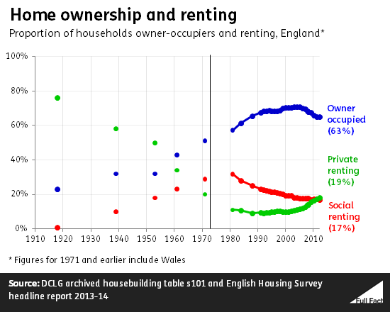
"We've got the biggest housing crisis for a generation, with home ownership falling, building half the homes we need, and the cost of renting or buying is soaring out of reach, especially in London and the South East."—Harriet Harman
The trend in home ownership is, indeed, that it's falling overall. Households in owner occupation in England peaked at 71% in 2003, and has since fallen gradually to 63%. That's mainly driven by a decline in those buying with a mortgage - the number of households who own their property outright has actually risen.
The second claim is also correct for England. In 2014, around 118,000 homes were completed. Meanwhile, the government estimates that each year between now and 2022 is likely to see the number of households rise by 220,000.
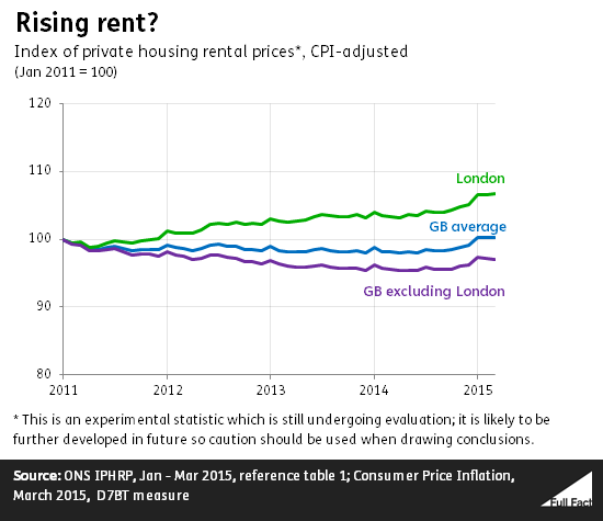
The cost of somewhere to live in London and south-east England is certainly up, on a range of measures. In London, the proportion of households renting privately has doubled over the past 10 years - it's now 30% of the total.
Their rents have been rising above (CPI) inflation recently, whereas in the rest of Great Britain it's the opposite, according to experimental figures from the Office for National Statistics.
"In 1980, working age welfare accounted for 8% of all public spending. Today it is 13%."—George Osborne
These figures are for the proportion of public spending made up of benefits and tax credits that went to people of working age and children.
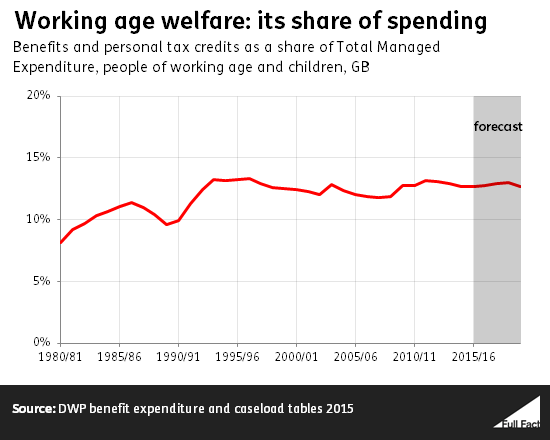
In 1980/81, spending on this group made up 8.1% of public spending, rising to a projected 12.7% in 2014/15. This March it was projected to make up around the same amount in 2019/20, although that was before the changes announced today.
Spending on benefits and tax credits for pensioners rose from 10.7% of public spending in 1980/81 to 15.5% in 2014/15.
"The number of young people starting apprenticeships is stagnating—it's not going up. New apprenticeships are skewed towards lower levels, whilst business are crying out for higher levels of skills." —Harriet Harman
The claim about the number of young people starting apprenticeships "stagnating" depends on what period you're measuring over, but it's reasonable if you just look at the last two years. Apprenticeship programme starts among under-25s fell by 1,000 between 2012/13 and 2013/14. A rise among under-19s was cancelled out by a fall among those aged 19-24—but there were 45,000 more apprenticeship starts for 19-24 year-olds than five years earlier.
We took a look at the debate over the quality of those apprenticeships during the general election campaign. The number of university-level higher apprenticeships is increasing, but it's still small relative to the number of lower-level apprenticeships.
"Four fifths of all journeys in this country are by road, yet we rank behind Puerto Rico and Namibia in the quality of our network."—George Osborne
This is true, but with a couple of caveats. It comes from the Global Competitiveness Report (GCR), which used data from a survey of "business leaders" around the world. If these business leaders don't have an accurate perception of where the UK would actually rank on road quality, then the GCR figure won't be accurate.
The UK was ranked 30th out of 144 countries for the quality of its roads, behind Namibia (28th) and Puerto Rico (29th), but ahead of New Zealand (35th), South Africa (37th), Australia (43rd), Israel (45th), Italy (57th) and Norway (74th).
While this might give a reasonably good assessment of how each country ranks against similar nations—a London-based business person might well have comparable expectations to a Parisian entrepreneur or a New York CEO—it seems possible that business people in different countries could have a different idea of what the best roads in the world might look like.
If the business people are comparing roads to their own experience—nearby nations and the recent past—then this might not do complete justice to the British network.