Prime Minister's Questions, factchecked
Join 73,000 newsletter subscribers who trust us to check the facts
Sign up to get weekly updates on politics, immigration, health and more.
Subscribe to weekly email newsletters from Full Fact for updates on politics, immigration, health and more. Our fact checks are free to read but not to produce, so you will also get occasional emails about fundraising and other ways you can help. You can unsubscribe at any time. For more information about how we use your data see our Privacy Policy.
“I see today that [Jeremy Corbyn] is talking about paying for extra wage increases in the NHS. I think we should first of all recognise actually that for people working in the NHS around half of those staff, because of progression and basic pay increases, will actually see on average a pay increase of 4%.”
Theresa May, 26 April 2017
Labour and the Liberal Democrats are promising to end the 1% cap on NHS pay increases.
But that cap doesn’t necessarily reflect the earnings of individual NHS workers. As people move up pay bands, they will earn more even though the salary for that pay band hasn’t moved much.
On the specifics of her figure, Mrs May might be referring to a report last month from the NHS Pay Review Body. It researches and makes recommendations on the pay of staff employed in the NHS except doctors, dentists and “very senior managers”. The report said that:
“The changes in earnings over time experienced by individual[s]... can be very different to trends in average pay due to pay progression, career progression, geographical movement and changes in personal working patterns. For example, slightly more than half (54 per cent) of NHS staff in England were due to receive pay increments of around 3 to 4 per cent on average in 2016/17 in addition to the 1 per cent pay award.”
We’ve asked the Department of Health about the figures.
Average earnings per person in the English NHS was £31,300 in the 12 months to December 2016, 0.7% more than the previous year. Inflation was 1.8% over the same period.
This average includes all staff, from consultants to cleaners, so there’s a lot of variation. It’s also the mean, so a few people earning a lot can make it much higher.
Doctors earned an average of £76,000, ambulance staff £36,000, and nurses, midwives and health visitors £31,000.
On the non-clinical side cleaners and maintenance staff earned an average of £17,000, managers £49,000 and senior managers £76,000.
“[Christopher] says in the last five years my husband has had only a 1% increase in his wages, the cost of living has risen each year. We now have at least 15% less buying power than then.”
Jeremy Corbyn, 26 April 2017
We can’t speak for Christopher’s situation in particular, but we can put that experience in context.
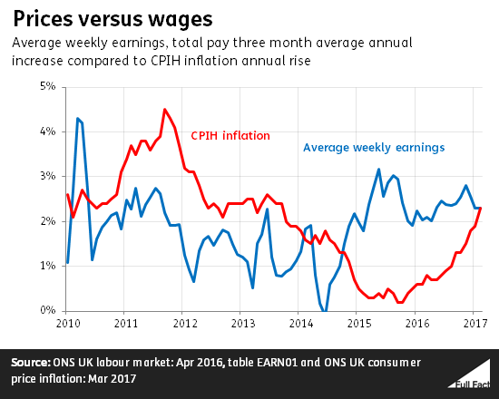
There’s no one way to measure the cost of living, but a common one is to look at whether people’s wages are keeping pace with rising prices.
Since 2010, there have been two distinct chapters to this story. Inflation—as measured by the CPIH index—was higher than wage growth from 2010 to 2014, meaning the real value of people’s pay packets was falling.
But wages have been rising faster since then, and average wages are now roughly back to the level they would have been had they been flat all along.
The latest figures show that inflation has caught up again, which means that wages are now, on average, stagnating.
Averages only tell you so much
These figures are all very broad because they’re taking averages: the average weekly wage compared to an average ‘basket’ of goods a household might buy, to calculate inflation. That gives you the bigger picture, but doesn’t tell you very much about your own situation.
If, like Christopher, your pay has only been rising 1% a year, then the value of your wages has been falling since last September, because annual inflation has been higher.
Prices, as measured by official inflation figures, are nearly 14% higher now than they were in 2010. So, in a sense, that’s one benchmark to work out whether your wages have kept pace. A 1% annual rise wouldn’t be enough.
You’re also more likely to be feeling the pinch in the public sector. Public sector workers’ pay is currently rising at 1.4% a year, behind inflation at 2.3% and private sector workers at 2.5%.
Even then, it’s worth bearing in mind that not everyone experiences the same inflation. It depends ultimately on what you spend your money on.
This isn’t a direct measure of living standards
These figures don’t tell us whether people are, overall, better or worse off economically. They don’t take into account what’s happening to taxes and benefits, for example.
The Office for National Statistics does produce broader figures on economic well-being, for example, that try to capture people’s ‘take-home pay’, after these kinds of thing have been taken into account.
These figures generally show living standards slumped in the early years since 2010, as the economy struggled in the wake of the financial downturn in the late 2000s. But in the past few years, most measures have shown increases again, in line with relatively low inflation.
“If [Jeremy Corbyn] wants to talk about pensions and pensioners looking to the future, then once again there will be a very clear choice at this election... between a Labour party who in government saw the increase in basic state pension of 75p in one year, and a Conservative government whose changes to pensions mean basic state pensioners are £1,250 better off.”
Theresa May, 26 April 2017
It’s true that the basic state pension rose by 75p per week in one year of the last Labour government (between 1999 and 2000). But the natural comparison isn’t with the total annual rise under seven years of Conservative-led government. In fact, pensions rose by more under Labour, on average, once you take inflation into account.
In simple cash terms, the full basic state pension rose by £141 a year on average under Labour compared to £183 a year under the Coalition and Conservative governments.
But as we’ve noted when assessing Ms May’s headline figure in isolation, this takes no account of price inflation. When taking the natural rise in prices (as measured by the Consumer Prices Index) into account, we see a different story.
In real terms, the full basic state pension went from roughly £4,800 a year in April 1997 to £5,800 a year in April 2010. So, on average, every year of the Labour government saw an increase of £82 in real terms. The real value of that pension under the Conservatives went from £5,800 to £6,400—an average annual rise of £75 a year.
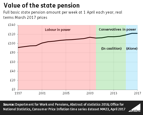
None of this is relevant to anyone retiring after 6 April 2016, as the basic state pension we’ve been discussing has been replaced with a new state pension scheme for more recent retirees. And we’ve been looking at the full amount of the basic state pension, which not everybody will be entitled to.
"With more people waiting more than four hours in A&E..."
Jeremy Corbyn, 26 April 2017
More people in England waited more than four hours to be seen in A&E in 2015/16 than did in 2010/11. While the number of A&E patients has increased since 2010, the share of people seen within four hours has also gone down.
In 2015/16 about 1.9 million attendances took more than four hours to be dealt with in all types of A&E departments in England. In 2010/11 around 560,000 waited more than four hours.
There are more attendances at A&E—there were about 21.4 million attendances to all A&Es in England in 2010/11, compared to roughly 22.9 million in 2015/16.
So more people—about 240,00 more—were seen within four hours in 2015/16 than in 2010/11.
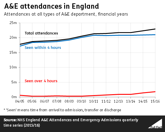
But the percentage of people seen within four hours has fallen. In 2015/16 92% of those who went to A&E in England were seen within four hours. 97% were seen within that time in 2010/11.
“The number of social rented homes under a Labour government fell by 420,000.”
Theresa May, 26 April 2017
The Prime Minister was referring here to the stock of homes rented from councils and housing associations, according to the Department for Communities and Local Government.
It’s correct that between 1997 and 2010 this fell by around 420,000 from 4.4 million to just under four million. This is due to a larger decrease in the number of council houses than the increase in the number of housing association homes available for rent.
There were still around four million homes provided by councils and housing associations in 2016, although the stock had increased by around 76,000 since 2010.

What that increase in the total availability of social housing may mask is a slowdown in provision of the very cheapest homes—those available at a 'social rent' of around half the market rate.
Between 1997/98 and 2009/10 around 363,000 new homes for social rent were made available, an average of around 28,000 a year. Since 2010/11 there have been around 122,000 made available, an average of around 20,000 a year.
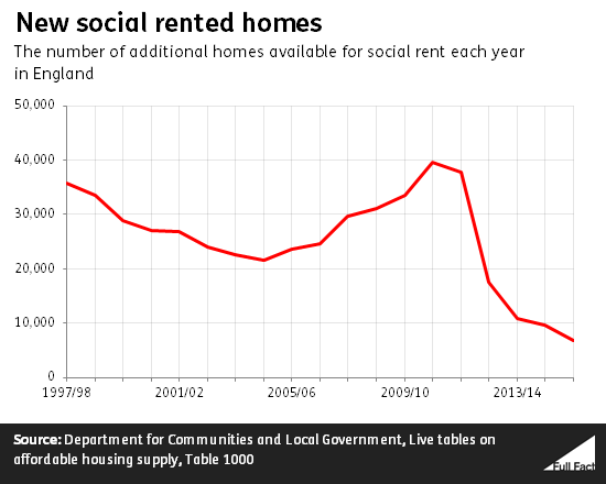
These figures tell us about the number of new homes for social rent becoming available. What about the existing stock of those homes?
We don't have figures going back far enough to compare Labour with the Conservatives, but we can see that the number fell between 2012/13 and 2015/16.
The number of homes for social rent owned by councils fell from almost 1.7 million to 1.6 million over the three-year period. That's a loss of almost 77,000 homes. The number of homes let by housing associations for the equivalent of social rent also went down. There were over 2.13 million in 2012/13 compared to 2.12 million in 2015/16, around 10,000 fewer.