Employment: What’s happened to wages since 2010
In this series of articles we try answer common questions about whether we can trust employment statistics, and go beyond the headline figures to assess the health of the labour market more comprehensively.
We’ve already looked at how employment is defined and whether people are working fewer hours and are on zero hours contracts.
In our final piece in the series, we look at what has happened to wages since 2010.
Ideally, we’d have one statistic that told us clearly what’s happened to wages, but unfortunately it isn’t that simple. We have multiple measures and none are perfect.
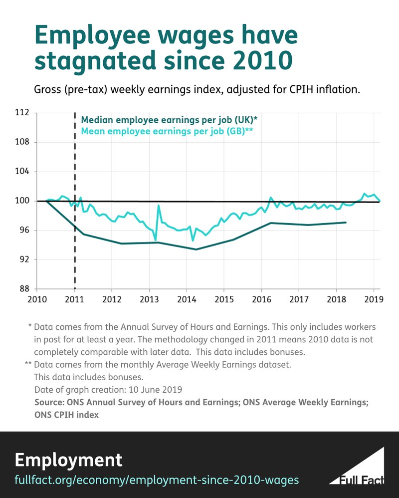
The Office for National Statistics (ONS) publishes two main measures of earnings. One is data on average weekly earnings, published every month, but it is limited for a few reasons:
- It doesn’t include self-employed people so a large number of workers’ wages aren’t captured in the data.
- It doesn’t include workers in Northern Ireland.
- It looks at the average wage per job, not per worker.
- It uses a mean average, which can be distorted by the wages of people who earn a very high amount.
The ONS also publishes annual data on earnings, which covers the whole of the UK and uses a more preferable median average. But, being an annual survey, it’s less timely, only covers workers who stay in the same job for more than a year and (like the average weekly earnings data) doesn’t include self-employed workers and measures the average wage per job, not per worker.
Finally, HMRC publishes separate data on the earnings of self-employed people, but with a considerable time lag.
Join 72,547 people who trust us to check the facts
Subscribe to get weekly updates on politics, immigration, health and more.
All the data tells a similar picture
Although no single dataset tells us everything about everyone, together they do tell a clear and consistent story. Earnings have stagnated, if not fallen in real terms since 2010, and remain below their 2008 peak.
What do we mean by “real terms”? Well, average earnings have increased in terms of the amount of cash going into people’s pockets since 2010. But so has the cost of living. Groceries, housing, utility bills and other household costs have increased since 2010.
The rate at which these things become more expensive is called inflation. And since 2010, the growth in earnings hasn’t exceeded inflation, which means that earnings have stagnated or fallen in “real terms”.
Between April 2010 and April 2018, the median pre-tax weekly earnings of an employee in the UK fell by around 3% in real terms.
As for self-employed people, there are two measures of note—how much self-employed people make from their self-employment income sources, and how much they make in total (including their income from other sources, such as investment income and pensions).
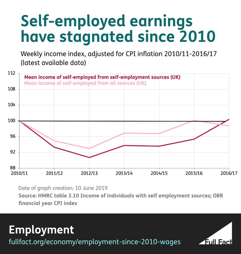
Between 2010/11 and 2016/17 the pre-tax average income of the self-employed in the UK fell by 1% in real terms while the amount earned specifically from self-employment sources stayed pretty much the same. More recent data isn’t available.
This data shows change in average earnings, not the average change
Of course, just because average wages are stagnant doesn’t mean everyone’s wages will have been so. Some groups may have fared better than others—we looked into this last year, finding workers in London, men, high-earners and young people had fared the worst since 2008.
But one thing that’s really important which we still don’t know is to what extent this national picture of stagnant wages is a result of the average person’s pay actually being stagnant, or whether it’s been affected by how the workforce changes each year.
To explain, let’s imagine an economy where there are five workers. In the first year, they’re paid £100, £200, £300, £400 and £500 per week. The mean wage is £300.
Now imagine that in year two, the person earning £500 retires, the other four get a 5% pay rise, inflation is 0% and a new worker enters the jobs market on a salary of £450 per week.
Every individual who worked in the first year has received a 5% real-terms pay rise. But because of changes in the composition of the workforce, the average wage has stagnated and is still £300.
So the fact we’re seeing stagnant wage growth may, in part, be because of the changes in who makes up the workforce, rather than what changes the average person is seeing to their earnings.
Despite changes to tax and benefits, earnings are lower
Finally, it’s worth considering the impact that changes to tax and benefits have had on earnings since 2010.
The data we’ve been talking about so far looks at pre-tax earnings. And while pre-tax earnings have stagnated, it doesn’t necessarily follow that earnings after tax and benefits have been applied have also stagnated.
Between 2010/11 and 2017/18 the mean post-tax household income of people in work fell by 1% in real terms.
Over the same period the mean post-tax income of a household in the labour force (so including employed and unemployed but not economically inactive households) rose by 1%.
(This data is equivalised, meaning the incomes of households are adjusted depending on their size and needs. For example a household of one working adult and one child earning £20,000 a year will be worse off in the data than a household of one working adult earning £20,000 a year. The household with the child in it will have its income adjusted in the data so that it is lower.)
In summary then, the change since 2010 in real post-tax income mirrors the change in real pre-tax income. Namely, that there hasn't been much change at all. Earnings, whichever way you look at them, are around the same level they were eight years ago.
More from this series:
- Why don't people trust employment statistics?
- Is employment up because the government is fiddling the statistics?
- Is employment up because more people are working on unstable zero-hours contracts?
- Are more people working in jobs with low and falling wages?