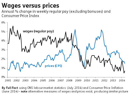
Bad graphs: wages versus prices
The latest employment figures are out: employment is rising and unemployment is falling, continuing the general trend for the past two years. But people's wages aren't keeping pace with rising prices.
To illustrate the latter point, this graph was circulated on Twitter this morning:
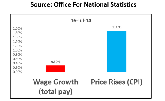
It's good to see a source for the figures, although it would be better if it were more specific, such as stating which release the figures are from.
Join 74,000 newsletter subscribers who trust us to check the facts
Sign up to get weekly updates on politics, immigration, health and more.
Subscribe to weekly email newsletters from Full Fact for updates on politics, immigration, health and more. Our fact checks are free to read but not to produce, so you will also get occasional emails about fundraising and other ways you can help. You can unsubscribe at any time. For more information about how we use your data see our Privacy Policy.
The problem is it doesn't compare like with like: the wage growth figures cover May last year to May this year, the prices figures are between June 2013 and June 2014 (the wages figures are also a three-month average ending in May each year, rather than a single month snapshot).
If we compare both sets of figures from May 2013 to May 2014, prices rose by 1.5% and wages 0.3%. The wage figures include bonuses as well, which can be more volatile than regular wages. If we take bonuses out of the equation, regular pay grew by 0.7%.
It's still the case that price rises are outstripping wages on these measures, but the scale of the difference being presented isn't accurate.
There's also the more vexed question of whether these two are the best measures to compare, which the ONS has discussed in depth elsewhere.