Revealed: how local election bar charts are misleading voters and using unreliable data
Local leaflets are providing unreliable information about how to vote tactically in the May elections, with national polling data, dodgy bar charts and even doorstep surveys used to support claims about parties’ likely standings, a Full Fact investigation reveals.
We analysed leaflets from across England that were uploaded to Democracy Club’s online archive in the first two weeks of April, and found some kind of chart or graphic in more than 50. In our assessment, at least 14 of these leaflets failed to provide reliable evidence to back up a specific claim about how people are likely to vote locally, or were unsourced or misleading in some other way.
See below for full details on six of the leaflets we fact checked:
- A mix-and-match chart makes more than 100% (Labour, Ealing)
- Is this really the battle for Gateshead Council? (Green Party, Gateshead)
- Local and general elections are different (Conservatives, Haslemere)
- Did anyone measure these Reform bars? (Reform UK, Chelmsford)
- Does this chart really say what it says it says? (Liberal Democrats, Eastgate and Moreton Hall)
- Doorstep surveys aren’t reliable evidence (Green Party, Cowley)
Among the 14 examples we identified in total, which came from all the major parties, we found:
- At least four gave people national polling numbers rather than data directly relevant to their area
- Three cited other data, such as Westminster constituency results or projections, that could not reliably support specific claims about the local area
- Two gave no source, making it impossible for voters to know how reliable they were
- Two from the same ward cited results from an older election, while ignoring those from a more recent by-election
- One reported results from doorstep surveys
- One used a mixture of less relevant polls
- One quoted previous election results from a different ward, which in any event did not appear to support the claim made
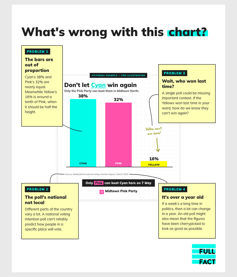
Several of the leaflets also displayed the data in misleading or questionable ways, for instance by using bars that were not in proportion to the numbers they represented.
To be clear, good data on voting intentions is often simply not available in local elections. And there is nothing wrong with political parties using other data as part of a pitch to voters, as long as it is properly explained. Indeed there have been big changes in the national polls in recent years that might need explaining.
But some of the leaflets we’ve seen could mislead people as they choose how to vote—for instance by claiming definitively that another party “can’t win here”, or that only one party can stop another, when there is no good evidence to show that’s true.
We shared our findings with the polling and political analyst Peter Kellner, the former chairman of YouGov, who told us: “When parties cite polling or election figures in campaign leaflets or social media, they should give the date, nature, geographical coverage and source of the data. If it does not relate solely and specifically to the ward or constituency being contested, this should be made clear.”
For more on how we conducted our analysis, see the methodology section below. We’re also grateful to our readers for sending us some of the other leaflets we mention in this article, in addition to those we found on Democracy Club. If you’ve seen an election leaflet you think could mislead people, let us know via our 2026 Elections Tipline.
Join 74,000 newsletter subscribers who trust us to check the facts
Sign up to get weekly updates on politics, immigration, health and more.
Subscribe to weekly email newsletters from Full Fact for updates on politics, immigration, health and more. Our fact checks are free to read but not to produce, so you will also get occasional emails about fundraising and other ways you can help. You can unsubscribe at any time. For more information about how we use your data see our Privacy Policy.
The battleground
England’s first-past-the-post electoral system means that the candidates with the most votes in each area get elected. Sometimes that’s just one candidate, but in many council wards it may be the top two or three.
This is a simple system that is easy to understand, but it does mean that voters with similar views sometimes want to coordinate behind one party, because if they split their votes between several rivals it becomes much easier for a candidate with completely different views to win.
In practice, however, this is not straightforward, because you can’t know in advance how everybody else will vote. And it’s particularly difficult in local elections, because there’s much less reliable polling at a local level—if any at all.
As a result, it’s easy to see why parties might want to use any data they can find to convince people that their candidate is the one that likeminded voters will support.
The six charts below illustrate some of the main problems we found. We approached all the parties concerned for comment.
A mix-and-match chart makes more than 100% (Labour, Ealing)
This chart appears on a Labour leaflet delivered to voters in Ealing Common, a ward in Ealing, west London, and it makes its intentions very clear.
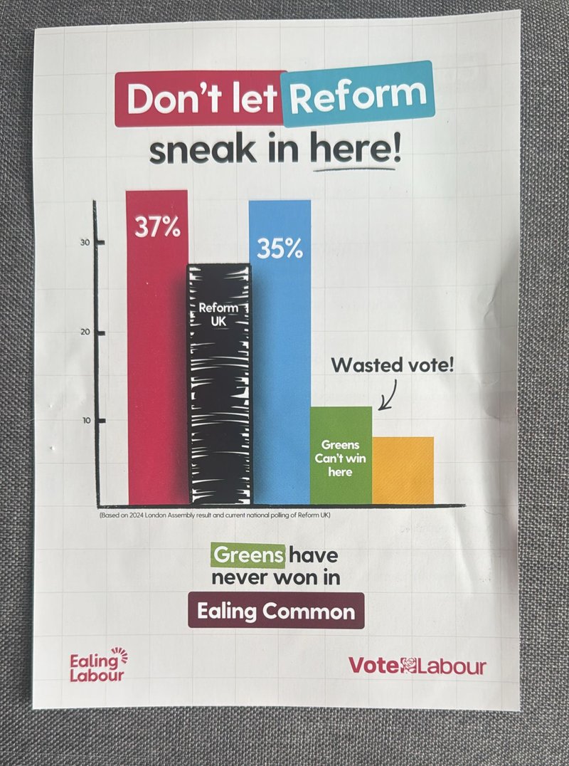
Looking at this, we’d expect voters in Ealing Common to conclude that Labour are the favourites where they live, the Conservatives and Reform UK are challengers, and the Greens and Lib Dems have no chance.
But the note at the bottom on its own is enough to show that there’s a problem here. The coloured bars come from the 2024 London Assembly result. Specifically, they look like the results of the constituency member votes for Ealing and Hillingdon. That’s a much larger area than Ealing Common ward, which accounts for three out of Ealing’s 70 councillors. (And Hillingdon has a further 53.)
It’s also a result from a different type of election, when voters may have had different priorities. And it’s a result from two years ago, since when people’s feelings may have changed.
The chart actually seems to acknowledge this. Because instead of using Reform’s comparable Assembly result of 8%, it adds another bar based on a more recent national poll—meaning it’s no longer even roughly close to Ealing—showing the party somewhere in the high 20s. (And in the process pushing the implied total over 100%, giving a picture that is both misleading and confusing.)
“What they've done is grotesque, and they've not been candid,” Mr Kellner told us. “The figures are in no sense indicative of Ealing Common.”
For context, two of Ealing Common’s three seats are currently held by the Lib Dems.
Ealing Labour Party told us: “The diagram is clearly an illustration of what could happen in a very competitive election, and can’t be taken literally, as no element of trying to predict the future can be.
“It conveys the very real and serious point that Reform are attempting to make real gains in Ealing, and people risk allowing them to sneak up through the middle. This is a common method of trying to make that point during an election campaign.”
Is this really the battle for Gateshead Council? (Green Party, Gateshead)
A leaflet from the Green Party in Gateshead makes a similar argument in a different way. This time the chart shows Reform in the lead with the Greens in second, beneath a headline that says the “Greens are now the only alternative to Reform”.
The same point is made even more explicitly elsewhere, with a message from Green Party leader Zack Polanski saying: “In Gateshead there’s only two options: Green or Reform”.
The note on the chart says it is based on YouGov opinion poll data from March 2026. And indeed there was a national voting intention poll from YouGov in March, which matched these numbers and put the Green Party in second place nationwide for the first time.
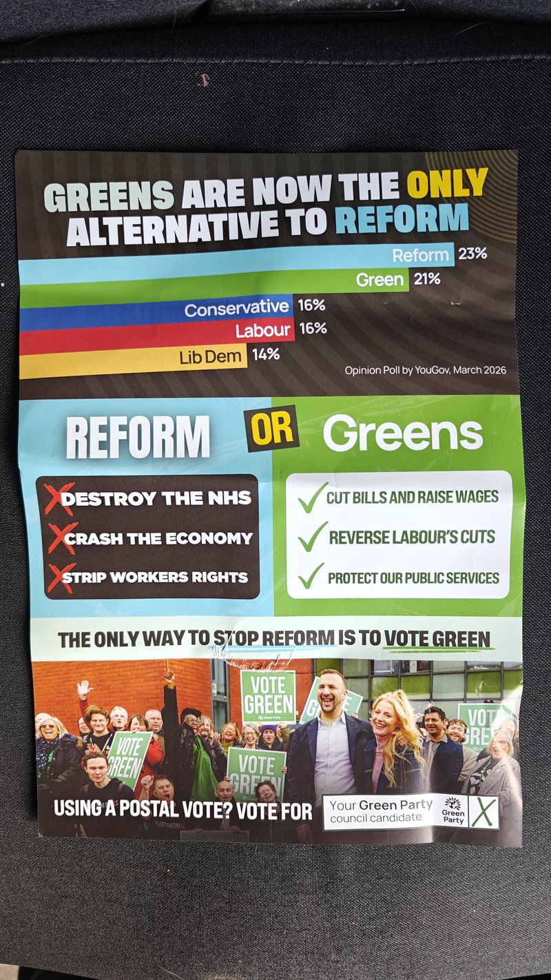
Setting aside the fact that YouGov’s national poll has changed since then, and currently puts the Greens third, this was never a good guide to the state of play in Gateshead—a specific place that doesn’t necessarily mimic the rest of the country. “National voting figures have no relevance to local contests in council elections,” Mr Kellner says.
This is a council made up of 66 seats, of which Labour currently hold 44, the Liberal Democrats 18, and the Greens and Reform zero. That is not to say that the Greens and Reform won’t do well this time. We have to wait and see. But the chart on this leaflet risks misleading voters because it is based on one poll that can’t reliably tell us what might happen locally.
We’ve seen national polls being used as the basis for claims in several local election leaflets, including a couple sent to us by readers.
Local and general elections are different (Conservatives, Haslemere)
This leaflet from the Conservatives in Haslemere tells voters “Reform can’t win here”, apparently based on data for the whole of Surrey from the 2024 general election.
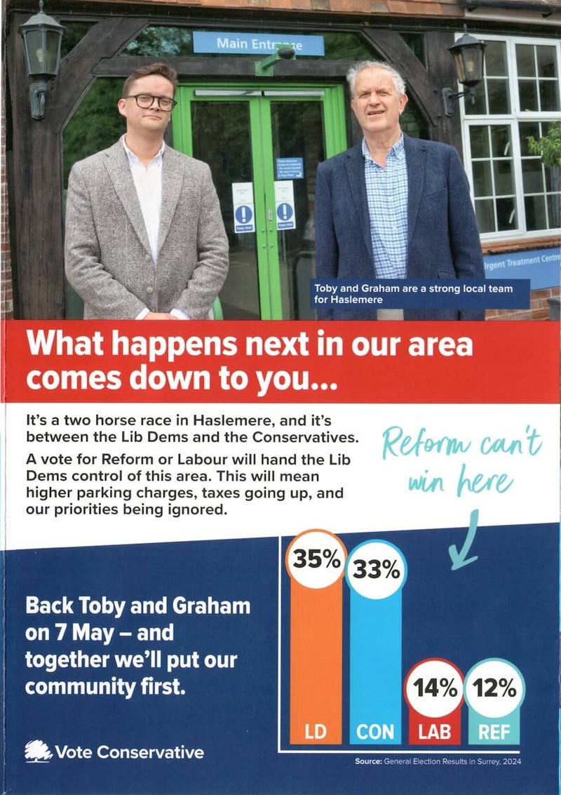
This is very unreliable evidence. Haslemere Ward is just one small part of Surrey, so the way that Surrey votes isn’t necessarily a guide to how Haslemere will. People may also have changed their minds about the parties compared with how they felt two years ago.
And crucially, local elections are not general elections. You can’t just assume that the same patterns will repeat themselves in both. “Local elections are different,” Mr Kellner told us. “We know that turnout in local elections is much less than in general elections, for example. A lot of people say they’ll vote but won’t.”
There may also be specific local issues or strong independent candidates that influence people’s choices locally, but not in general elections.
Did anyone measure these Reform bars? (Reform UK, Chelmsford)
The problems with this Reform leaflet from Chelmsford are simple.
There’s no source, which is a serious flaw for all the reasons we’ve already mentioned. Is this a local poll, or a national one? Is it recent, or out of date? Is it even relevant to Chelmsford? The leaflet doesn’t tell us.
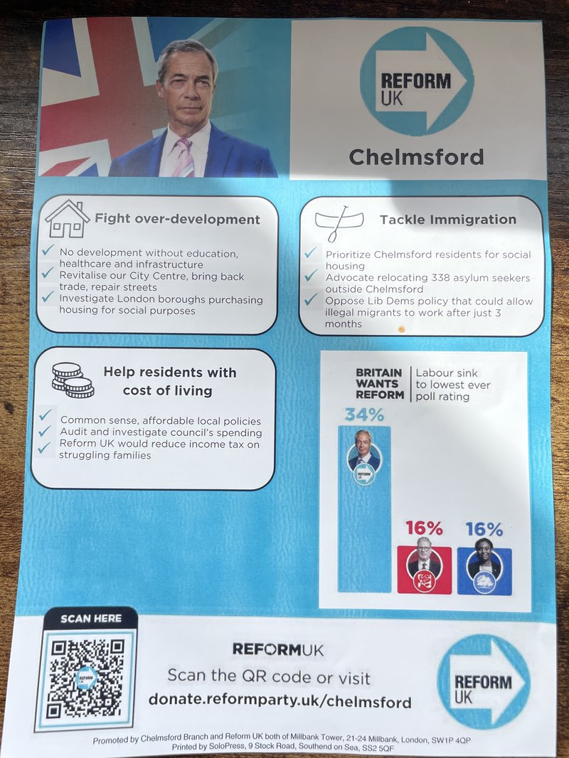
Still, if we’re being generous, the headline says “Britain wants Reform” so perhaps that means it’s a national poll, and Reform have polled at 34% with at least one pollster in the past—although we can’t find an exact match with the Conservative and Labour figures at the same time.
More straightforwardly, if you look at the numbers on top of the bars, it’s clear that they are completely out of proportion. Using an online calibration tool suggests that if the Reform bar represents 34%, the height of the Labour and Conservative bars puts them at about 9%—not 16%.
This is obviously misleading about the numbers themselves, whether or not they’re accurate or relevant.
Dodgy proportions in bar charts is a problem we’ve seen in at least two of the leaflets we’ve been sent by readers too.
Does this chart really say what it says it says? (Liberal Democrats, Eastgate and Moreton Hall)
A Liberal Democrat leaflet from Suffolk makes a strange claim even on its own terms.
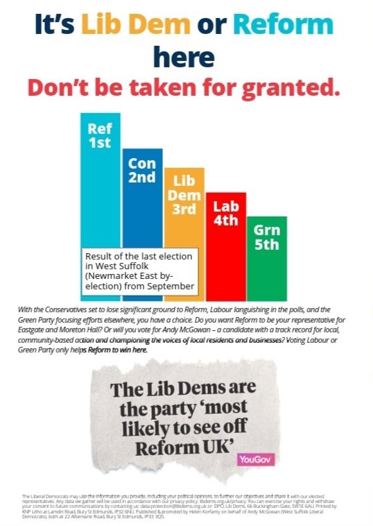
“It’s Lib Dem or Reform here,” the headline says. Yet the bar chart immediately beneath it shows the Conservatives in second and the Lib Dems in third. Why would the third party be a stronger contender than the one ahead of it?
For once, the fact that the data isn’t strictly relevant may offer an excuse, because the size of the bars is said to represent a recent election result somewhere else nearby. It’s therefore possible that the Lib Dems will be stronger contenders in this candidate’s division.
Below the chart, a quote attributed to the pollster YouGov says the Lib Dems are “most likely to see off Reform UK”. This may be a reference to this YouGov article from March 2025, which does say that, but which is based on a national poll conducted over a year ago in which voters were asked which party they would vote for if only Reform and the Lib Dems had a chance of winning.
This is not a reliable guide to voting intention in this part of Suffolk in May 2026. Nor did it ever tell us how people were planning to vote in practice—only how they would vote under certain imagined circumstances.
While the bars in the chart showing the nearby election result do reflect the correct order in which the candidates finished, they do not reflect the correct vote share, as some people seeing the chart might assume.
The result in question saw Reform gain the seat with about 30%, followed by the Conservatives on 25%, the Liberal Democrats on about 17% and Labour on 15%. That means the gap between the Lib Dem bar and the Conservative one would be larger than the gap between the Conservatives and Reform, if the chart were shown to scale. And the gap between Labour and the Lib Dems would be much smaller than the gap between the Lib Dems and the Conservatives.
The Liberal Democrat candidate’s agent told us: “The image is illustrative and not a true graph as such, which we emphasised by not putting in any indices.” They also told us there are other reasons why they believe Reform and the Liberal Democrats are the main contenders in this election, such as the apparent priorities of other parties.
Doorstep surveys aren’t reliable evidence (Green Party, Cowley)
This leaflet from the Greens in Oxford makes a fairly modest claim (“The Green Party can win in Cowley Ward with your support”), which taken very literally is clearly true. It supports the point with a chart that looks in proportion and is very clearly sourced with a detailed note.
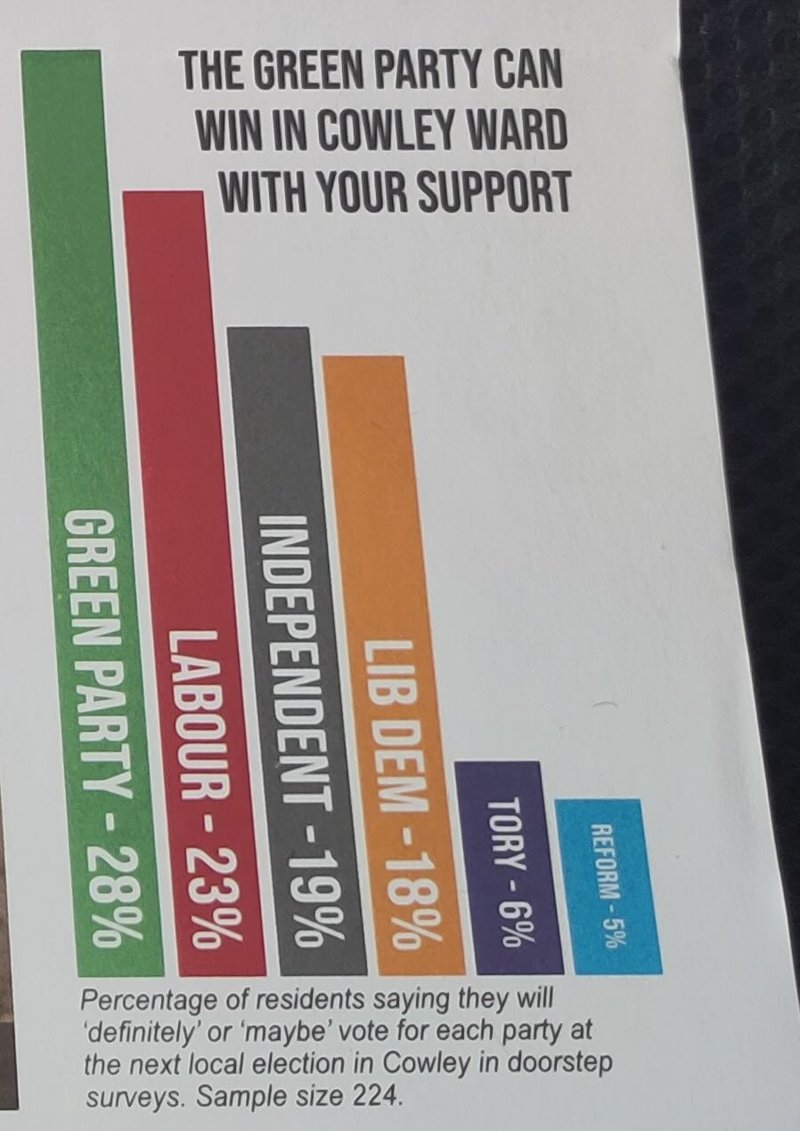
The trouble is what the note says. It reads: “Percentage of residents saying they will ‘definitely’ or ‘maybe’ vote for each party at the next local election in Cowley in doorstep surveys. Sample size 224.”
Is that something we can trust? Local parties often carry out doorstep surveys while campaigning for elections in order to gather a sense of how voters feel. But this is far from scientific polling, so it can’t be considered reliable evidence.
“Even if you assume the data is recorded honestly, it may not come from a balanced selection of houses,” Mr Kellner told us. “And people may want to be agreeable and pretend they’re more likely to vote for a candidate when they’re face-to-face with them."
So while the Green Party certainly “can win”, like any party standing in this election, this data can’t reliably tell us how likely that is—and there’s a real risk that people might take it more seriously than they should.
Chris Jarvis, leader of the Green Group on Oxford City Council, told us: “The graph on this leaflet clearly states where the data is sourced from and does not make any claim that it is an opinion poll. We would never refer to any data presented in a leaflet as 'polling' unless it was obtained by a British Polling Council member and was clearly relevant to the area where the leaflet was being distributed, nor would we seek to suggest that any surveys carried out in the city were a voting intention poll.”
What we did
Our analysis did not attempt to count the proportion of leaflets that are unreliable or misleading, or measure which parties or areas are most likely to produce them. But to get a sense of whether this is a common problem, we looked at 331 leaflets uploaded to Democracy Club’s online archive by members of the public in the first two weeks of April.
We looked for charts in the leaflets rather than reading all the text in them, and identified 59 examples in total.
Deciding what counts as unreliable or misleading has a subjective element. It isn’t always clear, for instance, whether readers will assume that a chart showing national polling data will be relevant where they live. But we tried to fairly assess what a voter might understand from the information on the chart, and whether it included reliable evidence provided to support this.
We spoke to two polling experts beforehand to help us judge the reliability of different types of data in different contexts. All our analysis has been checked by at least two different people.